Table of Contents
- 1. Maximize Brightness with High LRV Paints and Satin Finishes
- 2. Neutralize Cool Shadows Using Warm Blush and Golden Undertones
- 3. Pair Soft White Walls with 2700K-3000K Warm LED Bulbs
- 4. Illuminate Mid-Tone Colors using 4000K Neutral Artificial Light
- 5. Apply the Lighting and Paint Synergy Matrix to Your Space
- Illuminate Your Space: Final Design Thoughts
- Design Dilemmas Solved: Lighting & Paint
Walking into a room that feels perpetually stuck in twilight can be a design challenge; yet these shadowed spaces offer a unique opportunity to create a cozy and sophisticated sanctuary.
You do not need massive windows to achieve a high-end look.
Instead, you simply need to understand how color interacts with limited light to turn a dim corner into the most inviting spot in your home.
The secret lies in balancing undertones and understanding Light Reflectance Value, often called LRV.
While it is tempting to paint everything bright white, many professional designers recommend warm neutrals or even deep, moody hues that embrace the shadows rather than fighting them.
Testing your samples at different times of the day is essential, as even the most beautiful shade can shift dramatically when the sun goes down.
Whether you are tackling a weekend DIY project or planning a complete room refresh, choosing the perfect color is a balance of science and creativity.
Start with small swatches on multiple walls to see how your artificial lighting plays with the pigments.
With a few thoughtful choices and a bit of patience, you will create a space that feels intentional, stylish, and perfectly tailored to your lifestyle.
1. Maximize Brightness with High LRV Paints and Satin Finishes

When dealing with limited natural light, your wall color must work harder. This is where Light Reflectance Value comes in. It is a critical tool for dark spaces.
Light Reflectance Value measures how much light a color reflects. A score of zero absorbs all light, while a hundred reflects it completely.
For dim rooms, choose shades with a value above sixty. These tones actively bounce ambient lighting around the space. This improves spatial flow and feels airy.
LRV, or Light Reflectance Value, measures the percentage of light a paint color reflects. The higher the LRV, the lighter the color.
Sue Wadden, Sherwin-Williams Color Education
But color is only half the strategy. The finish you select completely alters how light travels across your walls. Flat paints absorb light and close off rooms.
Instead, opt for a satin or eggshell finish. A subtle sheen acts like a soft mirror. It catches the glow from your brass sconces and warm table lamps.
This gentle reflection creates a luminous and warm ambient glow. It beautifully highlights organic textures like raw wood and soft linen furniture.
A satin finish is the secret weapon of dark rooms, turning heavy shadows into a soft and ambient glow.
Beyond aesthetics, satin finishes improve everyday functionality. They are incredibly durable and resist moisture, making them very easy to wipe clean.
This makes them perfect for high-traffic areas. You can use this trick when exploring simple small bathroom ideas where natural light is scarce.
| Paint Finish | Light Reflection | Best Room Application |
|---|---|---|
| Matte / Flat | Low (Absorbs light) | Ceilings, very low-traffic areas |
| Eggshell | Moderate (Subtle bounce) | Living rooms, cozy bedrooms |
| Satin | High (Soft glowing sheen) | Windowless rooms, dark hallways |
| Semi-Gloss | Very High (Direct reflection) | Trim, interior doors, cabinets |
Before committing, test swatches on multiple walls. Observe how the satin finish interacts with your curated lighting setup throughout the day.
Mastering finishes is essential for budget makeovers. It helps when exploring top interior design styles living room ideas on a budget.
A fresh coat of high-reflectance paint instantly elevates the mood. Your formerly dark space will finally feel curated, welcoming, and brilliantly styled.
Designer Paint Hacks
- Always verify the Light Reflectance Value (LRV) before purchasing paint. Aim for a score above 60 to actively bounce ambient light around your dimmest rooms.
- Ditch flat paints in dark spaces. Opt for a satin or eggshell finish to create a subtle, mirror-like sheen that catches the glow from your sconces and lamps.
- Paint test swatches on multiple walls and observe them throughout the day to see exactly how the satin finish interacts with your specific lighting setup.
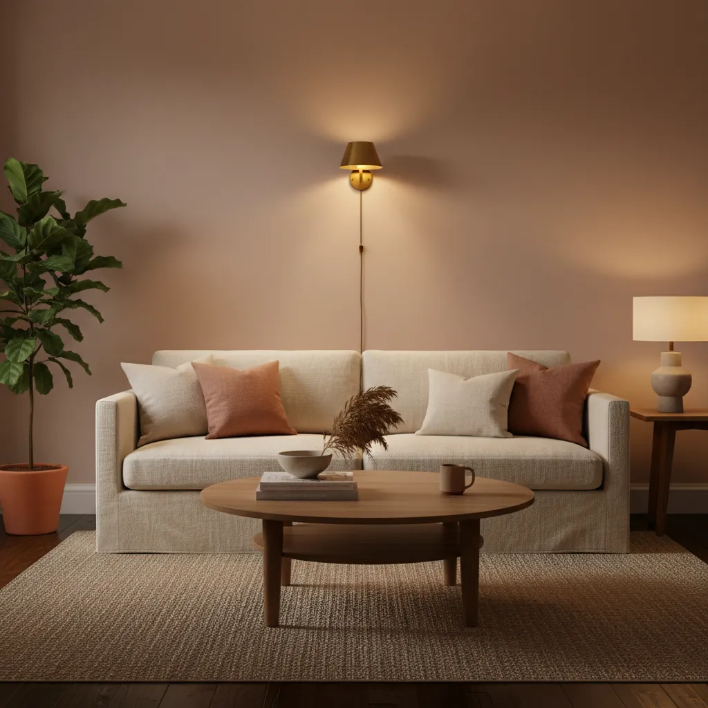
2. Neutralize Cool Shadows Using Warm Blush and Golden Undertones
Choosing the Perfect Warm Blush

Rooms with limited sunlight often develop a chilly, grey cast. To fix this, introduce warm blush or soft golden undertones. These shades actively neutralize cool shadows.
The science is simple. Warm colors reflect light differently, faking the glow of the afternoon sun. This instantly improves the spatial flow of your room.
Soft pinks are a brilliant alternative to neutral shades, as they add instant warmth to spaces that receive very little natural light.
Patrick O’Donnell, Homes & Gardens
When you apply a golden-tinted finish, the walls act like subtle reflectors. A matte finish in these hues brings out a curated, velvety texture that feels cozy.
If you want to create a cozy winter bedroom look, golden undertones are essential. The subtle warmth actively wraps the entire space in deep comfort.
Warm blush is the secret ingredient for turning cold shadows into a comforting, ambient glow.
Texture and Lighting Synergy

The right palette does more than change the color. It transforms how ambient lighting bounces around the room. Pair these warm walls with rich textures like raw wood.
Golden hues look especially stunning alongside organic materials. Adding a plush linen sofa or a statement piece in mid-century oak enhances the inviting hygge vibe.
Why Warm Tones Work in Low Light

Using blush and gold is highly practical for everyday living. It elevates your home interior and solves tricky shadow issues beautifully.
- Combats Blue Light: Neutralizes the harsh, icy tones of indirect northern sunlight.
- Boosts Depth: Flat walls gain a dynamic, dimensional finish as the day progresses.
- Enhances Wood Tones: Natural oak and walnut furniture look noticeably richer against golden hues.
Another practical tip is to carry this palette into transitional spaces. This creates a cohesive spatial flow that guides the eye effortlessly from room to room.
Try testing a golden blush tone near your front door when you style a console table in an entryway for an instant, welcoming warmth.
Style Secret
- Test warm blush or golden paint samples on northern-facing walls to observe how they neutralize chilly, grey light throughout the day.
- Pair your warm-toned walls with organic textures like a plush linen sofa or raw oak furniture to amplify the cozy, ambient atmosphere.
- Apply a matte finish when using golden or blush hues to create a velvety texture that softly diffuses ambient light rather than reflecting it harshly.
3. Pair Soft White Walls with 2700K-3000K Warm LED Bulbs

Lighting completely dictates how paint colors appear in your home. Without natural sunlight to balance the room, soft white walls can quickly look flat.
Upgrading your bulbs is the easiest fix. You can instantly transform a dull corner by swapping cool blue lights for a warm ambient glow.
For a beautifully curated space, renter-friendly upgrades like changing lightbulbs make a massive visual difference.
Aim for 2700K to 3000K LED bulbs. This specific temperature range mimics the golden hour, bringing out the creamy undertones in soft white paint.
The right light bulb is the secret ingredient that turns flat white walls into a warm, inviting sanctuary.
Imagine soft linen curtains and a raw oak console table bathed in a warm glow. The organic textures feel instantly richer and more tactile.
Functionally, this warm lighting temperature reduces eye strain. It creates a smooth spatial flow that makes navigating dark halls feel comforting.
In a home, you almost always want a warm light. I recommend 2700 Kelvin for living spaces, which mimics the warm glow of traditional incandescent bulbs.
Mitchell Parker, Houzz
Understanding exactly how light temperature alters your wall color is crucial for a cohesive design palette.
| Light Temperature | Visual Effect on White Paint | Best Room Application |
|---|---|---|
| 2700K (Warm White) | Enhances creamy, yellow undertones | Cozy living rooms and bedrooms |
| 3000K (Soft White) | Keeps whites crisp but never clinical | Bathrooms and ambient kitchens |
| 4000K+ (Cool White) | Turns soft whites stark and blue | Garages or dedicated workspaces |
Layering Your Lighting Sources

Directional lighting also impacts how your wall color reads. A beautiful brass wall sconce bouncing light upward creates soft, flattering shadows.
If you are updating a workspace, explore our modern office decorating ideas to properly layer task lighting with warm ambient light.
Layering light sources removes harsh shadows. A central pendant combined with matching table lamps ensures your soft white walls glow evenly.
The Glow Guide
- Install dimmer switches to adjust the intensity of your 2700K bulbs, allowing you to transition from functional brightness to a cozy evening ambiance.
- Choose fabric lampshades in linen or cotton to further diffuse warm light, eliminating harsh glares on your soft white walls.
- Use uplighting or wall sconces to bounce light off the ceiling, which makes small rooms feel taller and more expansive.
4. Illuminate Mid-Tone Colors using 4000K Neutral Artificial Light

When natural daylight is scarce, artificial lighting becomes your most powerful design tool. Mid-tone paint colors often look muddy in dim spaces.
Introducing a 4000K neutral light mimics the crispness of natural sunshine. This specific temperature lifts mid-tone walls and improves spatial flow.
Lighting is everything. It creates atmosphere, drama and intrigue in a room.
Martyn Lawrence Bullard, Architectural Digest
Optimizing the Visual Palette

Mid-tone blues and greens transform beautifully under a 4000K ambient lighting scheme. The light cuts through shadows and highlights organic finishes.
Warm bulbs cast an unwanted yellow veil over cool colors. A neutral 4000K bulb ensures your curated palette retains its true visual depth at night.
The US Department of Energy states LED lighting uses up to 75% less energy. Upgrading to an LED bulb is a highly efficient choice.
Renters often struggle with harsh overhead fixtures. Swapping standard bulbs for neutral LEDs is an easy modern living room upgrade.
Creating a Layered Lighting Layout

A single overhead light creates harsh glare and flattens a room. Layering multiple sources creates a sense of hygge and highlights your focal point.
Place 4000K bulbs in floor lamps and sconces to distribute light evenly. This eliminates dark corners and naturally expands the perceived spatial flow.
Focus on these key placements to maximize your neutral lighting:
- Task Zones: Use focused 4000K desk lamps to brighten workspaces without causing eye strain.
- Curated Vignettes: Angle a small spotlight on floating shelves to showcase tactile ceramics.
- Ambient Glow: Add dimmable neutral bulbs to a mid-century floor lamp near a linen chair.
This layered approach perfectly balances minimalism and warmth. Neutral light keeps the overall atmosphere clean, bright, and deeply inviting.
Balanced neutral light elevates rich texture like velvet or raw oak. It perfectly brightens cozy winter decor without feeling clinical.
Mastering 4000K neutral light is the secret to unlocking the hidden depth of mid-tone paint in any dark room.
Lumen Logic
- Prioritize bulbs with a high Color Rendering Index (CRI) of 90+ to ensure your mid-tone paints retain their true hue without shifting toward gray.
- Install dimmable 4000K LEDs to allow for a seamless transition from bright, productivity-focused daytime light to a softer, atmospheric evening glow.
- Use 4000K plug-in puck lights or LED strips inside dark shelving units to eliminate ‘dead zones’ and highlight the texture of your decor against mid-tone backdrops.
5. Apply the Lighting and Paint Synergy Matrix to Your Space

Mastering the lighting and paint synergy matrix changes everything. It balances your chosen palette with artificial ambient lighting.
This strategic approach improves spatial flow in any dim area. Spaces feel curated and intentional rather than dark and dreary.
Let us explore how to mix finishes and bulb temperatures perfectly. Every statement piece deserves to be illuminated properly.
Your room’s atmosphere depends not just on the paint you choose, but on the light that dances across it.
The Glow Guide
- Pair warm 2700K bulbs with earth tones to enhance richness, while using 3000K-4000K bulbs for cool grays and blues to prevent a muddy appearance.
- Use matte finishes in rooms with heavy natural glare to diffuse light evenly, or choose high-gloss for narrow hallways to bounce artificial light further.
- Always test paint swatches vertically next to your primary light source to see how shadows and bulb temperature shift the pigment’s true hue.
Match Bulb Temperatures to Paint Undertones

A warm bulb brings out yellow notes in your palette. Cooler bulbs enhance blues and crisp organic greens beautifully.
You must harmonize the wall finish with your chosen bulbs. Matte velvet textures absorb harsh glare from bright floor lamps.
This specific styling technique works beautifully to highlight a carefully curated console table in an entryway.
| Light Temperature | Ideal Paint Undertone | Atmosphere Created |
|---|---|---|
| Soft White (2700K) | Earthy terracottas and warm whites | Cozy, hygge, relaxed |
| Warm White (3000K) | Soft greiges and muted sage greens | Inviting, organic, balanced |
| Cool White (4000K) | Crisp blues and pure neutral grays | Modern, minimal, alert |
The lighting in your room will dictate exactly how your paint color will look. Always test your paint colors in your space.
Nicole Gibbons, Clare Paint Design Guide
The Glow Guide
- Test paint samples at different times of day under both natural light and your specific bulb’s Kelvin rating to ensure the undertone stays true to your vision.
- Pair matte or velvet paint finishes with high-intensity bulbs to eliminate distracting surface glare and maintain a soft, high-end appearance.
- Use 3000K bulbs as a ‘safe’ middle ground for open-concept spaces that feature a mix of warm wood tones and cool-toned decor elements.
Test the Finish Before You Commit

Glossy finishes bounce light but can reveal hidden wall flaws. A flat finish offers deep rich color without aggressive reflection.
Eggshell strikes the perfect functional balance for walls. It gently enhances ambient lighting without causing harsh visual glares.
This finish trick is excellent for simple small bathroom ideas where space is tight. It visually expands the footprint easily.
- Sample multiple swatches: Paint large squares on different walls to see shadows.
- Check at night: View the paint under your artificial lamps after sunset.
- Consider your floors: Dark oak floors reflect differently than light tiles.
The Finish Line Secrets
- Move your sample boards to different corners throughout the day to see how shifting light alters the sheen level.
- Test the finish on a patch of wall with minor imperfections to see if the gloss level highlights or hides texture.
- Paint your sample right up against existing trim to ensure the contrast between wall and woodwork finishes feels intentional.
Illuminate Your Space: Final Design Thoughts
Transforming a dark room is entirely possible with the right color strategy. By prioritizing high LRV paints, you instantly multiply any available ambient light.
Remember to embrace satin finishes to create a soft, welcoming glow. This simple swap banishes heavy shadows and beautifully highlights your room’s natural textures.
Finally, warming up those chilly corners with blush or golden undertones ensures your space feels cozy. Now, grab your swatches and start creating your glowing oasis.
Design Dilemmas Solved: Lighting & Paint
A satin or eggshell finish is ideal for windowless spaces. The subtle sheen acts like a soft mirror, bouncing ambient light around the room without looking too glossy.
LRV, or Light Reflectance Value, dictates how much light paint bounces back. Choosing an LRV above sixty ensures your hallway reflects light rather than absorbing it.
It is risky, as cool colors can make dark rooms feel icy and grey. Instead, opt for warm undertones like blush or soft gold to neutralize shadows and add coziness.
