Table of Contents
- Mastering Flow with Strategic Layouts for Compact Coffee Bars
- Hiding Operational Clutter with Seamless Japandi-Inspired Storage
- Amplifying Space Using Monochromatic Palettes and Strategic Mirrors
- Solving Echo Issues with Textural Acoustics and Raw Wood Finishes
- Softening Harsh Lines with Curated Biophilic Design Elements
- The Perfect Pour in a Tiny Footprint
- Curated Solutions for Compact Brewing
Transforming a small corner into a sophisticated coffee haven begins with a clear vision of intentionality.
It is about balancing soft textures with clean lines to ensure the space feels curated rather than crowded.
By prioritizing a minimal layout, you can easily maximize every square foot while keeping the atmosphere warm and welcoming.
Achieving this designer look does not necessitate an expensive overhaul or professional help.
Simple adjustments like choosing a neutral color palette and incorporating natural wood accents can elevate your home with ease.
These practical tips help you merge high-end aesthetics with accessible, budget-friendly DIY strategies that prioritize both beauty and utility.
Whether you are styling a compact kitchen or a quiet reading nook, the secret lies in creating a flow that feels completely natural.
Selecting versatile furniture and focusing on open surfaces ensures your home remains a tranquil retreat for years to come.
Use these principles to build a space that mirrors the charming, effortless elegance of your favorite boutique cafe.
Mastering Flow with Strategic Layouts for Compact Coffee Bars

Creating a functional coffee station requires more than just premium beans. The spatial flow determines if your morning ritual feels calm or chaotic.
In a compact setting, every inch must serve a purpose. You need to visualize the movement required to brew a single cup without obstruction.
The goal is to eliminate unnecessary steps. A well-planned layout allows you to reach for a mug, grind beans, and froth milk in one fluid motion.
True minimalism isn’t about having less. It is about making room for more of what matters: your morning ritual.
The Barista Blueprint
- Adopt a linear workflow by arranging tools from left to right in order of use; grinder, machine, then knock box; to minimize cross-movement.
- Maximize vertical potential by installing a shallow floating shelf above your station for mug storage, keeping the countertop clear for active brewing.
- Group small accessories like tampers and scales on a dedicated tray to maintain visual calm and ensure they are always within arm’s reach.
The Linear “Assembly Line” Setup

The most efficient design for narrow spaces is the linear layout. This mimics the assembly line found in professional cafes but on a smaller scale.
Place your grinder on the far left and the espresso machine in the center. Keep knock boxes or accessories to the right to guide your hand movement.
This setup works exceptionally well on shallow console tables. It keeps the workflow unidirectional, preventing crossover and spills during brewing.
For more inspiration on fitting this into tight areas, explore Top Coffee Bar Ideas for Small Counter Spaces: DIY.
Barista Flow Hack
- Customize the direction based on your dominant hand: right-handed brewers should arrange gear left-to-right to avoid crossing arms, while lefties should go right-to-left.
- Use adhesive cable clips along the back of the console legs to keep power cords invisible, maintaining the clean lines of your linear setup.
- Place a narrow tamping mat or silicone tray under your grinder to catch stray grounds, keeping your shallow workspace tidy without sacrificing surface area.
Utilizing Corners with the L-Shape

Corners are often dead space in a kitchen or dining room. Converting a corner into a coffee nook maximizes depth that a linear counter lacks.
Push the bulky machine deep into the corner angle. This frees up the front counter space for prepping your cup or pouring latte art.
Use texture to define this zone. A honed marble tray under the machine catches drips and visually separates the coffee gear from other decor.
In a small room, you have to edit. You have to be ruthless about what stays and what goes.
Nate Berkus, Architectural Digest
The Nook Blueprint
- Invest in a rotating tray or ‘Lazy Susan’ to keep bean canisters and syrups within reach in deep corners.
- Utilize vertical space with floating shelves above the machine for mug storage to keep the counter clutter-free.
- Add a low-wattage accent lamp to eliminate shadows in the corner and create a warm, café-inspired atmosphere.
Comparison of Compact Layouts
Choosing the right configuration depends on your available footprint. This comparison breaks down the spatial requirements for common layouts.
| Layout Style | Best For | Spatial Benefit | Visual Impact |
|---|---|---|---|
| Linear | Narrow hallways | Preserves walkway width | Clean, horizontal lines |
| L-Shape | Kitchen counters | Utilizes deep corners | Cozy, enclosed vignette |
| Vertical | Tiny apartments | Uses wall height | Draws the eye upward |
| Mobile Cart | Multi-use rooms | Flexible positioning | Open and airy feel |
Layout Logic
- Mount floating shelves above a linear setup to maximize vertical storage without sacrificing floor space.
- Choose a mobile cart with locking casters to ensure stability when used as an extra prep surface.
- Install a mirror behind an L-shaped layout to reflect light and create the illusion of a larger, more open corner.
Zoning for Efficiency

Regardless of layout, you must establish clear zones. Separate the “wet zone” where brewing happens from the “dry zone” used for storage.
The wet zone requires durable materials. Consider a backsplash that protects walls from steam, similar to 15 DIY Rustic Farmhouse Kitchen Backsplash Ideas.
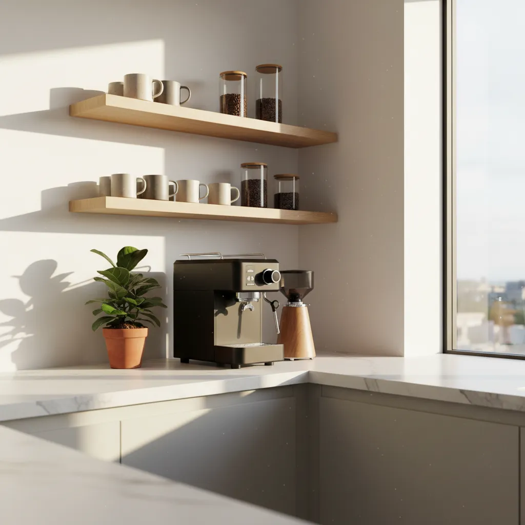
Store beans and sugar in the dry zone away from heat. Use airtight glass jars with wood lids to maintain freshness and add organic warmth.
Keep cups within arm’s reach above the machine. Floating shelves in raw oak or walnut create vertical storage without closing off the room.
The Workflow Win
- Install a slide-out tray under your espresso machine to easily pull it forward for refilling water or venting steam away from upper cabinets.
- Dedicate a small ceramic vessel or vintage crock specifically for used spoons and stirrers to keep your wet zone surfaces spotless.
- Keep a microfiber cloth tucked behind the machine for immediate wipe-downs, preventing coffee oils and steam from dulling your backsplash or shelves.
Hiding Operational Clutter with Seamless Japandi-Inspired Storage

A true coffee shop aesthetic relies heavily on the absence of visual noise. The counter always looks pristine.
Achieving this at home requires hiding the “operational” clutter. You need specific zones for beans, filters, and tools.
Japandi design offers the perfect solution here. It blends Japanese rustic minimalism with Scandinavian functionality.
The goal is to prioritize clean lines while ensuring your daily brew tools remain accessible.
Zen Storage Secret
- Decant coffee beans and ingredients into matching matte ceramic canisters to eliminate the visual noise of loud, branded packaging.
- Use a low-profile wooden or bamboo tray to corral daily essentials like your scale and tamper, turning loose clutter into a curated vignette.
- Install shallow drawer dividers for paper filters and cleaning tools so your countertop remains reserved only for your most beautiful equipment.
The “Appliance Garage” Concept

Bulky machines can disrupt the serene flow of a minimal room. An appliance garage creates a dedicated hideaway.
Tambour doors are a classic Japandi choice for this. These slatted wood doors roll up or slide sideways smoothly.
They add vertical texture to the room without swinging out into your walking path. This saves precious floor space.
When breakfast is over, you simply slide the door shut. The visual clutter vanishes instantly.
In small spaces, closed storage is your best friend. It allows you to maintain a sense of calm and order, even if the inside of the cabinet is a bit chaotic.
Emily Henderson, Small Space Design Rules
If you are looking for specific layouts for these compact areas, check out these top coffee bar ideas for small counter spaces.
Designer Secrets for Zen Counters
- Install integrated power outlets inside the cabinet so you can use your coffee maker or blender without ever moving it.
- Add a pull-out sliding tray to the base of the garage to easily access water reservoirs or heavy stand mixers.
- Ensure your tambour door material matches your cabinetry grain for a seamless, invisible look when closed.
Decanting for Visual Silence
Packaging is often the biggest source of visual clutter. Bright logos and mismatched bags destroy the vibe.
Decanting ingredients into uniform containers creates immediate harmony. It turns storage into decor.
Choose clear glass jars with bamboo or cork lids. This introduces natural textures typical of the aesthetic.
Minimalism isn’t about having less; it’s about making room for what matters most.
Arrange these jars on a simple floating shelf. The repetition of shapes is pleasing to the eye.
The Decant Edit
- Apply minimalist labels to the bottom or back of jars to maintain a clean aesthetic while keeping contents identifiable.
- Buy pantry staples in bulk to ensure your jars stay full and you avoid storing half-empty original packaging elsewhere.
- Group jars by the color of their contents to create a soft, natural gradient that enhances the sense of visual order.
Curating the Display vs. Concealed Storage
Not everything needs to be hidden. The key is knowing what to display to create that cozy atmosphere.
Use this checklist to separate your “display items” from your “concealed items” for a balanced look.
- Display (Open Shelving): Ceramic mugs in neutral tones, glass jars with coffee beans, a vintage pour-over kettle.
- Conceal (Closed Cabinets): Paper filters, cleaning brushes, bags of backup beans, electronic cords, mismatched mugs.
- Texture Boost: Use a woven seagrass basket on the counter to hold loose items like sugar packets or stirrers.
- Backdrop: Consider rustic farmhouse backsplash ideas to add texture behind your open shelves.
The Curated Edit
- Group items in odd numbers like sets of three to create a more organic and intentional look on your open shelving.
- Hide visual clutter like plastic packaging by decanting essentials into glass or ceramic jars for an instant aesthetic upgrade.
- Place taller items like a vintage kettle in the back and smaller mugs in the front to add visual depth and dimension to your display.
Seamless Cabinetry Integration

To maintain a sleek look, opt for cabinetry without visible hardware. Push-to-open latches are ideal here.
Handleless fronts create a smooth surface that allows the eye to travel uninterrupted across the room.
Select matte finishes over high-gloss options. Matte surfaces absorb light and feel softer and more organic.
Light oak or ash wood tones keep the space feeling airy. Darker woods can feel too heavy for a small corner.
The Seamless Edit
- Align wood grain patterns vertically across adjacent drawer fronts to create a single continuous visual plane.
- Match your toe kicks to the cabinet finish to give the unit a refined custom-built and weightless appearance.
- Use integrated appliance panels to ensure dishwashers or fridges don’t interrupt the clean lines of your cabinetry.
Amplifying Space Using Monochromatic Palettes and Strategic Mirrors

Creating a spacious feel in a compact footprint requires visual continuity. When eyes stop at high-contrast borders, the room feels smaller. A monochromatic palette solves this instantly.
By utilizing a single color family, you blur the hard lines between walls, trim, and furniture. This technique creates a seamless spatial flow that mimics the airy vibe of modern cafes.
Ideally, you should select warm neutrals like oatmeal, parchment, or soft terracotta. These hues reflect light softly rather than absorbing it, maintaining a cozy atmosphere.
If your room lacks natural brightness, selecting the right tone is crucial. You can explore 22 best paint colors for low-light rooms to find a shade that keeps the space airy.
Monochrome isn’t about boring uniformity; it is about exploring the infinite depth of a single hue to create a calm sanctuary.
Layering Textures Over Colors

In a coffee shop setting, interest comes from texture, not chaos. When the color palette is simple, tactile elements become the focal point of the design.
Mix materials like raw wood, boucle fabrics, and matte ceramics. These variations create shadows and highlights that add depth without shrinking the visual space.
A velvet armchair placed against a wall of the same color disappears visually while still offering comfort. This “furniture camouflage” is essential for minimalism.
A room should feel collected, not decorated. The best way to do that is to stick to a strict palette but go wild with texture.
Leanne Ford, Architectural Digest Interview
The Architectural Window Effect

Mirrors are the most effective tool for faking square footage. In a small cafe aesthetic, they act as “architectural windows” where none actually exist.
Place a large mirror opposite a natural light source. This bounces sunlight deep into the room, effectively doubling the brightness and the perceived width of the space.
Avoid small, cluttered mirrors. Go for large scale pieces with thin frames. An oversized round mirror can soften the boxy feeling of a small apartment living room.
You can also integrate mirrors into shelving units.
If you are designing a focal point, check out these 20 media wall ideas for cozy, sleek living for inspiration on blending storage with reflective surfaces.
Checklist: Optimizing Reflective Surfaces
Use this checklist to ensure your mirror placement enhances the “coffee shop” vibe without creating unwanted glare or visual clutter.
- The Window Twin: Position a mirror directly across from a window to maximize daylight reflection.
- The Artificial Glow: Place a mirror behind a table lamp to double the ambient warmth in the evening.
- The Infinite Hallway: Hang a mirror at the end of a short hallway or entryway to elongate the visual path.
- The Greenery Hack: Position a mirror to reflect a large indoor plant, making your indoor garden feel twice as lush.
- The Frame Finish: Choose matte black or brushed brass frames to match the industrial-minimalist cafe aesthetic.
Spatial Secrets
- Adopt the ‘color drenching’ technique by painting baseboards, doors, and ceilings in the same hue as your walls to eliminate visual breaks and trick the eye into seeing a taller space.
- Introduce a ‘mirrored floor’ effect by using a high-gloss floor finish or a large reflective coffee table; reflecting the room’s lower half creates an immediate sense of added depth.
- Layer at least three distinct textures; such as a chunky knit throw, a matte ceramic vase, and a grain-rich wooden stool; to prevent a monochromatic palette from looking flat.
Solving Echo Issues with Textural Acoustics and Raw Wood Finishes

Minimalism often struggles with a common enemy known as the echo chamber effect. Large open spaces with hard surfaces create a cold and hollow sound.
To achieve that hushed coffee shop atmosphere, you must interrupt sound waves. This does not mean cluttering the room but rather layering strategic materials.
True luxury is not just what you see, but the quiet comfort you feel when you step inside.
The Sound of Serenity
- Choose slatted raw wood panels to naturally diffuse sound while adding a warm, tactile dimension to minimalist walls.
- Incorporate floor-to-ceiling textured linen curtains to act as a soft sound barrier against large glass windows.
- Layer low-pile rugs or cork underlays beneath furniture to trap echoes and create a more intimate, grounded atmosphere.
The Science of Softening with Textiles

Fabric is your primary tool for sound absorption in a minimal space. Heavy drapes and plush rugs trap noise before it bounces off drywall or glass.
Consider hanging art that serves a dual purpose. Instead of framed glass prints, opt for decorative tapestries made of wool or cotton to dampen noise.
These fabric elements add visual warmth without breaking the clean lines of the design. They create a cocoon effect that feels instantly safer and calmer.
Texture is the secret ingredient that makes a room pop. It adds dimension to a room and engages our sense of touch and sight.
Bobby Berk, Design 101: Texture
Texture Tactics
- Opt for floor-to-ceiling velvet or heavy linen curtains to maximize sound absorption while adding a sense of luxury and height.
- Layer a plush, high-pile rug over a flat-weave base to trap sound more effectively and add tactile depth to minimalist flooring.
- Swap out glass-fronted frames for canvas or fabric-wrapped acoustic panels to reduce echo without sacrificing your wall art aesthetic.
Raw Wood as an Acoustic Diffuser

While fabric absorbs sound, uneven surfaces like raw wood diffuse it. This scattering of sound waves prevents the harsh ringing noise typical in empty rooms.
Incorporating wood slats or tambour panels creates a high-end architectural look. This adds depth to the walls while breaking up flat surfaces.
For a budget-friendly approach, try installing a beadboard feature. A half wall makeover with wooden trim significantly improves room acoustics.
Choose finishes that feel organic rather than glossy lacquers. Matte and raw oaks absorb more light and sound to enhance that cozy hygge feeling.
Acoustic Layering Checklist

Use this checklist to ensure your minimal space sounds as good as it looks. A balanced room should include at least three of these elements.
- High-Pile Rugs: Place a thick rug pad underneath specifically to dampen footfall noise.
- Upholstered Furniture: Choose sofas with textured fabrics like boucle or corduroy over sleek leather.
- Canvas Art: utilize gallery-wrapped canvas paintings instead of glass-fronted frames.
- Wood Elements: Add open shelving with raw wood edges or a slat wood room divider.
- Window Treatments: Install floor-to-ceiling linen curtains to soften the largest hard surface in the room.
Sound-Smart Styling
- Vary the thickness or depth of your wood slats to create a more effective ‘scatter’ pattern for sound waves.
- For maximum acoustic performance, mount wood panels over a thin layer of charcoal felt to absorb sound while the wood diffuses it.
- Avoid high-gloss sealants; a natural oil or wax finish keeps the wood’s surface texture intact for better sound interaction.
Softening Harsh Lines with Curated Biophilic Design Elements

Minimalist design often relies on sharp angles and clean geometry. While visually striking, these elements can sometimes feel sterile or cold.
To achieve that welcoming coffee shop vibe, you must introduce softness. Biophilic design bridges this gap by bringing organic shapes indoors.
The goal is not to create a jungle. Instead, select a few sculptural plants that act as living art pieces within the space.
Nature is not a place to visit. It is home. Bring the organic world inside to ground your spirit and your space.
Strategic Plant Placement for Spatial Flow

Placement is just as critical as the plant variety you choose. A tall snake plant can draw the eye upward, making low ceilings feel higher.
Trailing plants, such as Pothos or String of Hearts, work perfectly on high shelves. They break up the rigid horizontal lines of bookcases.
Consider the vessel as much as the foliage. For a truly custom look, you can try easy hand painted flower pots that match your neutral palette.
Matte white or terracotta containers maintain the minimal aesthetic. They add texture without introducing visual clutter or chaotic colors.
Plants do more than just sit there; they sculpt space. A large tree can act as a room divider, while a cluster of small pots creates a vignette that invites you to pause.
Hilton Carter, Architectural Digest: Guide to Styling Plants
Layering Organic Textures

Biophilic design extends beyond just greenery. It involves incorporating materials that mimic the natural world to soothe the senses.
Raw wood, unpolished stone, and woven fibers are essential. A jute rug grounds the room and offers a tactile contrast to smooth concrete floors.
Wall treatments also play a significant role in softening acoustics. Adding decorative tapestries made of cotton or wool can warm up a stark white wall instantly.
These soft textures absorb sound, replicating the hushed, intimate atmosphere of your favorite quiet café.
Best Plants for Minimalist Aesthetics
Choosing the right plant ensures your space remains uncluttered. Focus on interesting leaf shapes and architectural growth patterns.
| Plant Variety | Visual Aesthetic | Best Placement | Light Needs |
|---|---|---|---|
| Snake Plant | Vertical, structural, architectural | Corner floor accents | Low to Bright |
| Monstera Deliciosa | Wide, organic, statement piece | Next to a sofa or armchair | Medium Indirect |
| Rubber Tree | Glossy, dark, moody | Entryway focal point | Bright Indirect |
| ZZ Plant | Waxy, dense, symmetrical | Side tables or shelves | Low Light Tolerant |
Remember to dust the leaves regularly. Dusty plants can dull the vibrant green that is essential for this fresh, lively look.
By carefully curating these natural elements, you transform a sterile room into a breathing space. It becomes a sanctuary for relaxation.
The Living Layer
- Soften sharp-edged shelving or cabinetry by placing trailing plants like Pothos or String of Pearls on the top ledge to create a natural, cascading waterfall effect.
- Contrast sleek, smooth minimalist surfaces with highly textured planters made from unglazed terracotta, seagrass, or woven jute to ground the room’s energy.
- Use a single, large-scale structural plant like a Monstera or Fiddle Leaf Fig as a soft room divider to define zones without blocking light or adding bulk.
The Perfect Pour in a Tiny Footprint
Designing a minimal coffee corner is about intentionality. It transforms a daily routine into a mindful ritual.
Whether you choose a linear setup or utilize a corner, the key is efficient flow. Let your layout guide your hand.
Remember, true luxury in a small space isn’t about size. It is about the seamless blend of utility and aesthetic calm.
Curated Solutions for Compact Brewing
Use adhesive cord clips behind the machine or route cables through drilled grommets. A decorative marble tray can also mask messy wires effectively.
Stick to monochromatic tones like matte black, warm white, or natural oak. This reduces visual noise and keeps the focus strictly on the coffee.
Absolutely. A shallow console table works wonders. Just ensure you have at least 30 inches of clearance for walking past comfortably.
Install a wall-mounted rail with S-hooks above your machine. It utilizes vertical space and turns your ceramics into a functional display.
