Your office isn’t just a space it’s your launchpad for big ideas, deep focus, and nonstop creativity. But if the walls around you are draining your energy instead of boosting it? Houston, we have a productivity problem.
What if the simple act of changing your paint color could completely shift your focus, improve your workflow, and spark next-level motivation? Spoiler alert: It totally can.
We’ve curated the ultimate list of 22 office paint colors that do more than just look pretty. These hues are psychology-backed, vibe-checked, and designed to make your workspace work harder.
Get ready to transform your office from “meh” to mega-efficient.
1. Pale Oak
A whisper-soft greige that blends beige and gray in a way that feels organized but calm. Ideal for minimalist vibes with a side of clarity.
Neutral tones reduce visual clutter and encourage mental clarity and task prioritization. It’s subtle but powerful just like a great workday.
2. Hale Navy
A bold and moody navy that signals authority. This color creates depth, stimulates focus, and encourages high-performance mindsets.
It creates strong visual structure and promotes discipline and mental stamina. Turns your workspace into a productivity fortress.
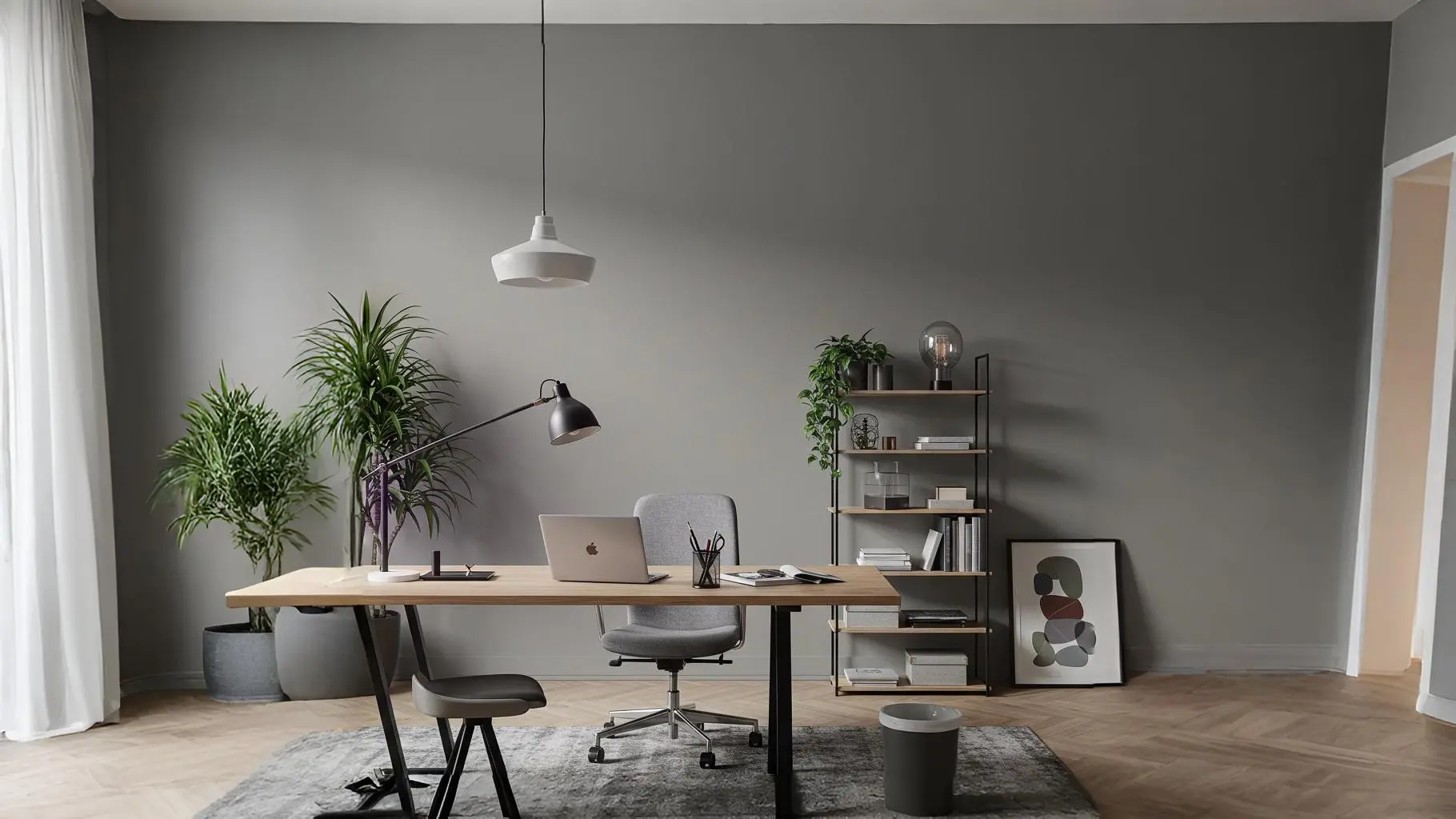
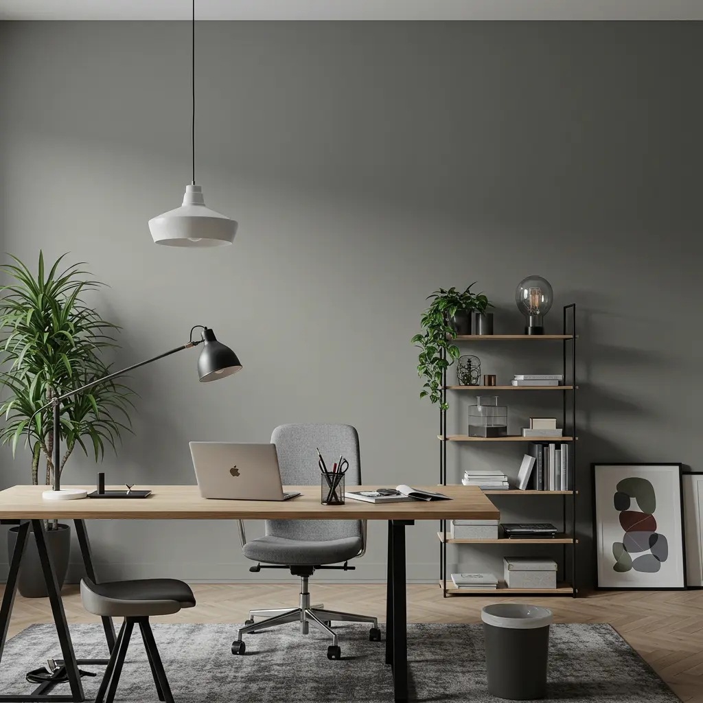
3. Repose Gray
This one is a Gen Z-approved favorite. It’s subtle, stylish, and seriously effective at calming overactive brains.Muted tones mean less cognitive load and help ease into deep work.
Pairs great with light woods and modern minimalism.
4. Soft Fern
This earthy green reminds you of a forest retreat but with Wi-Fi. Fresh and revitalizing, it brings your focus back to nature’s rhythm.
Green shades are proven to reduce stress and enhance visual comfort during long hours. If your brain needs a reset, this is the paint equivalent of a walk in the woods.
5. Alabaster
Not quite white, not quite cream. Alabaster is soft, warm, and an expert at bouncing light around.
It enhances light flow in small or dim offices and keeps you alert without being aggressive. It’s low-key powerful and fits with literally any style.
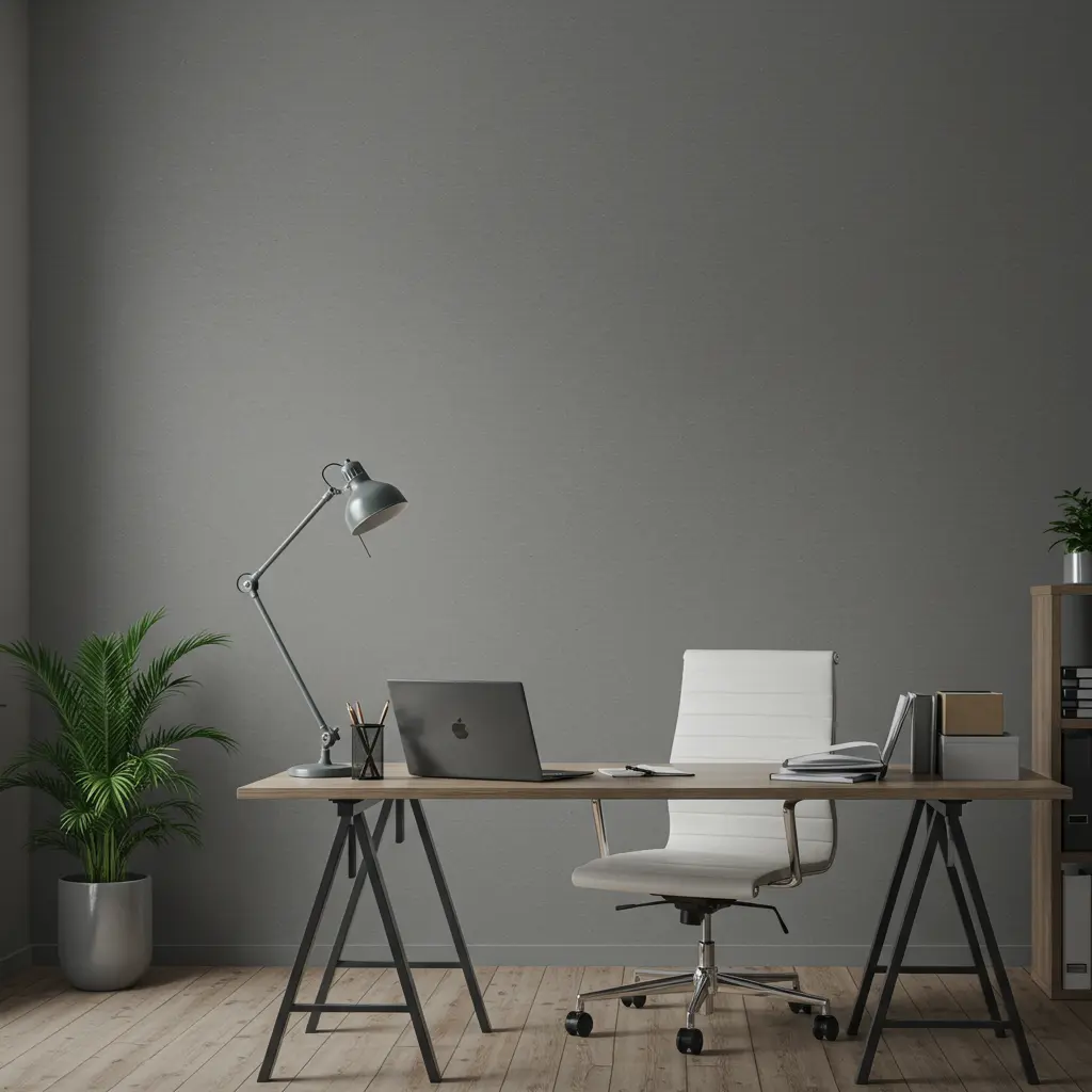
6. Mindful Gray
Appropriately named, this one helps create a grounded, serene environment that lets your thoughts land.Mid-tone neutrals reduce overstimulation and keep your mental space balanced.A backdrop for brainwaves and breakthroughs.
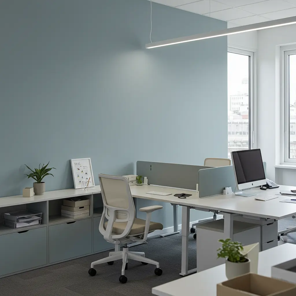
7. Pale Smoke
With bluish undertones, Pale Smoke feels cool and modern without being sterile.Blue tones boost concentration and reduce heart rate.Ideal for data-heavy or analytical tasks. Modern, clean, and brain-friendly.
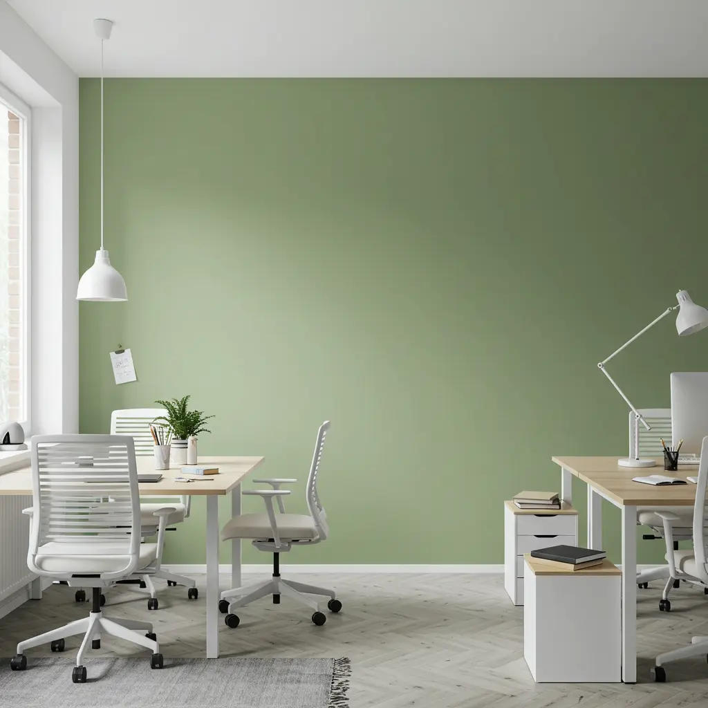
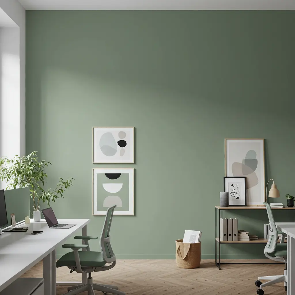
8. Muted Sage
It’s like a green tea break for your walls. Muted Sage promotes calmness and mental restoration essential when you’re juggling deadlines.
It helps regulate emotions and offers a subtle, refreshing backdrop for focus. No stress. Just strategy.
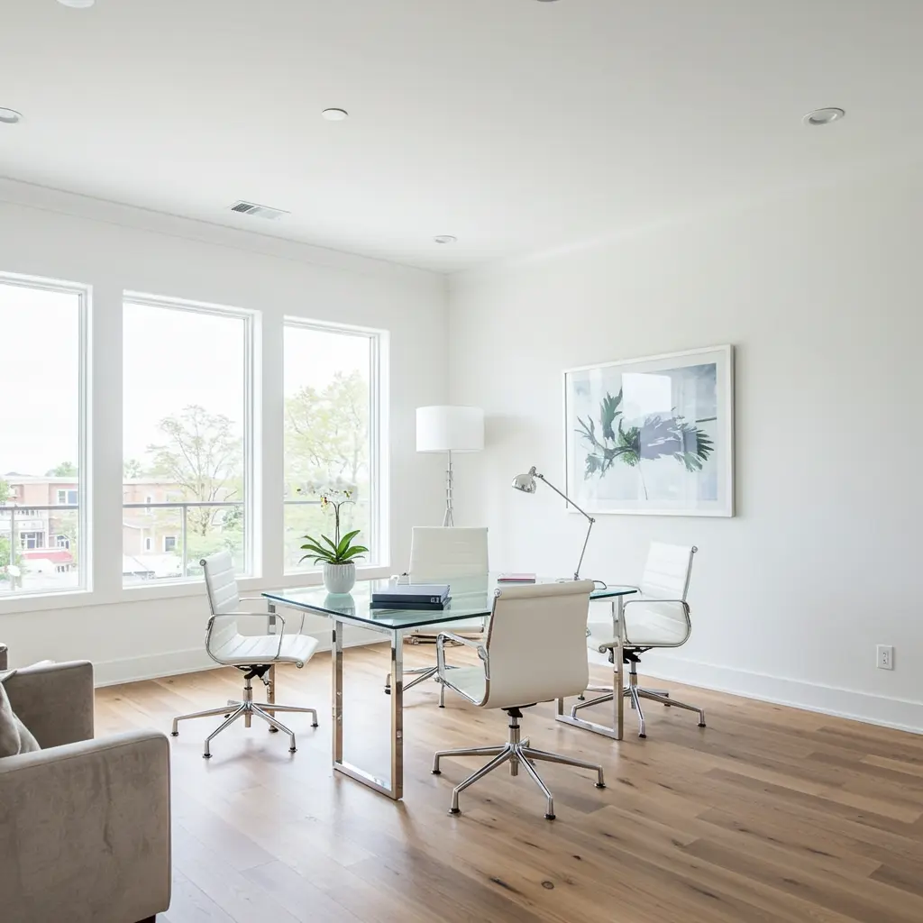
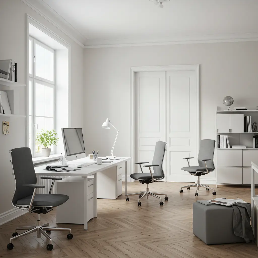
9. Simply White
A classic, bright white that energizes without feeling clinical. Perfect for open, modern workspaces.
It maximizes natural light and makes small rooms feel bigger and more energized. Crisp, clean, and wide open for ideas.
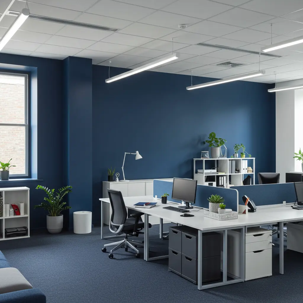
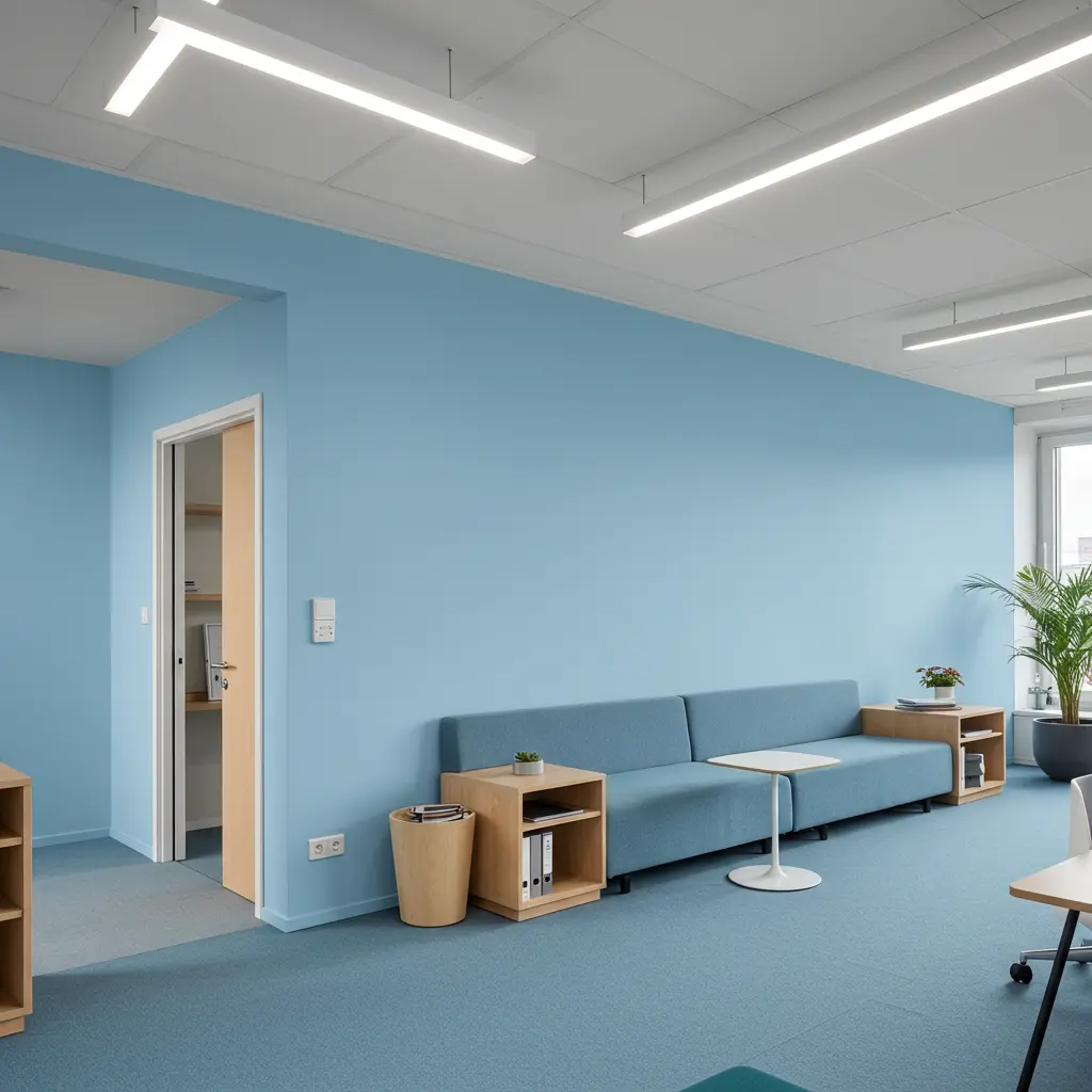
10. Storm Cloud
A deep, complex gray-blue that fosters concentration and blocks out distractions.It promotes laser-focus and helps define zones in open-plan offices.Creates a thoughtful contrast that sharpens your thoughts.
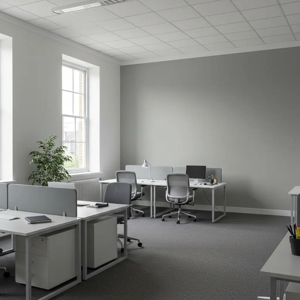
11. Classic Gray
Clean, soft, and not too warm. This shade balances your space while encouraging alertness.It avoids visual fatigue and provides an easy backdrop for any decor style.A quiet achiever in your productivity toolkit.
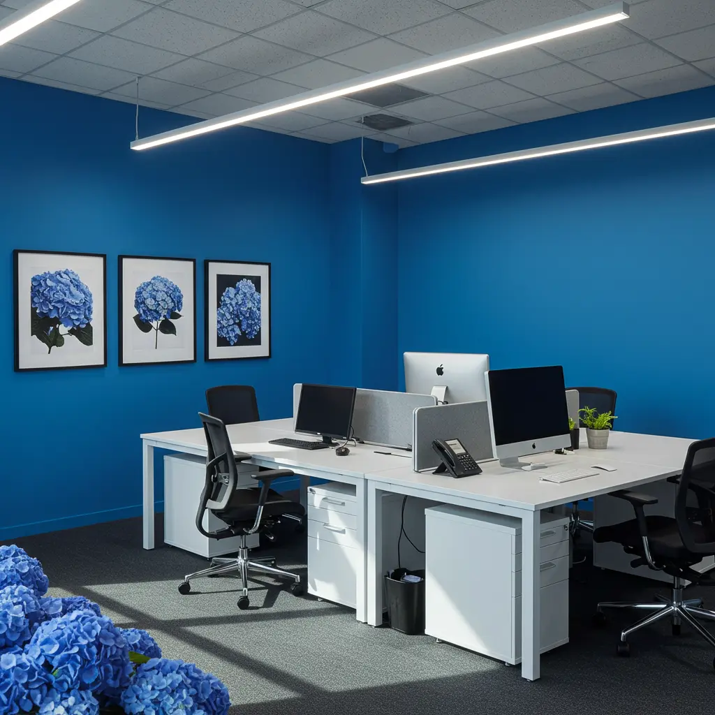
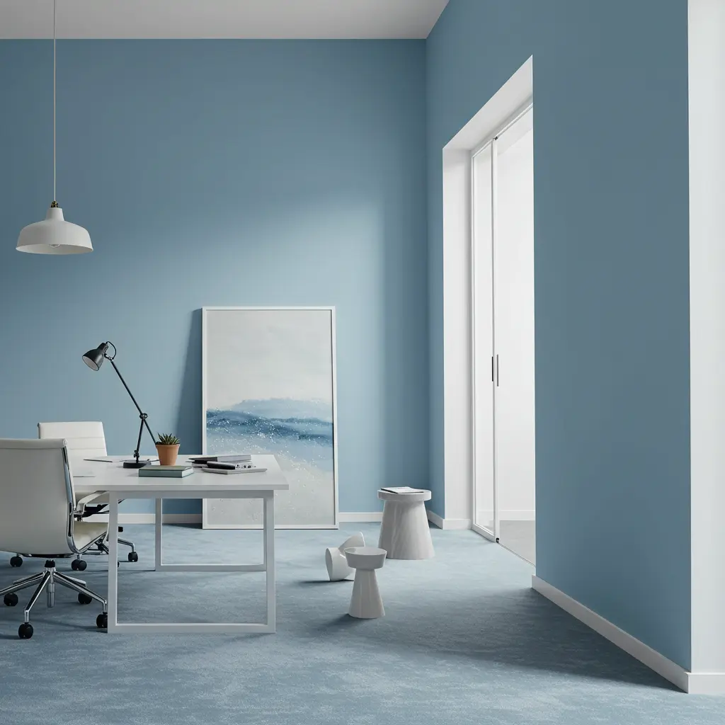
12. Blue Hydrangea
Cheerful but chill. This soft blue inspires innovation and calm, a powerful combo for brainstorming sessions.It encourages creativity and reduces stress during long workdays.For when you need blue-sky thinking.
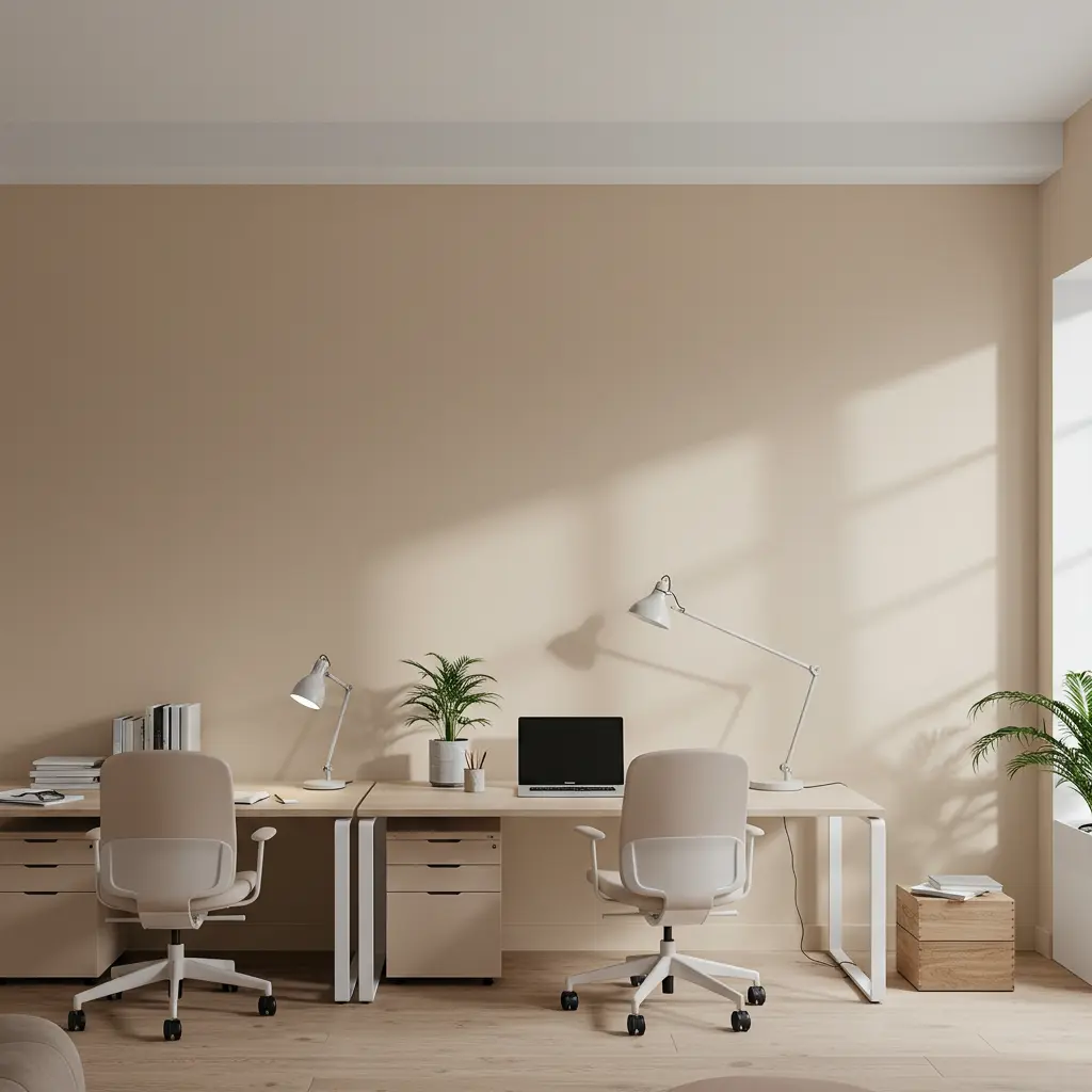
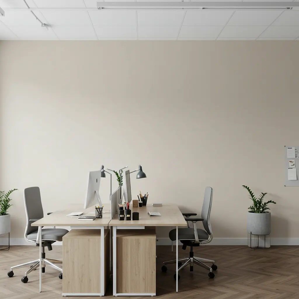
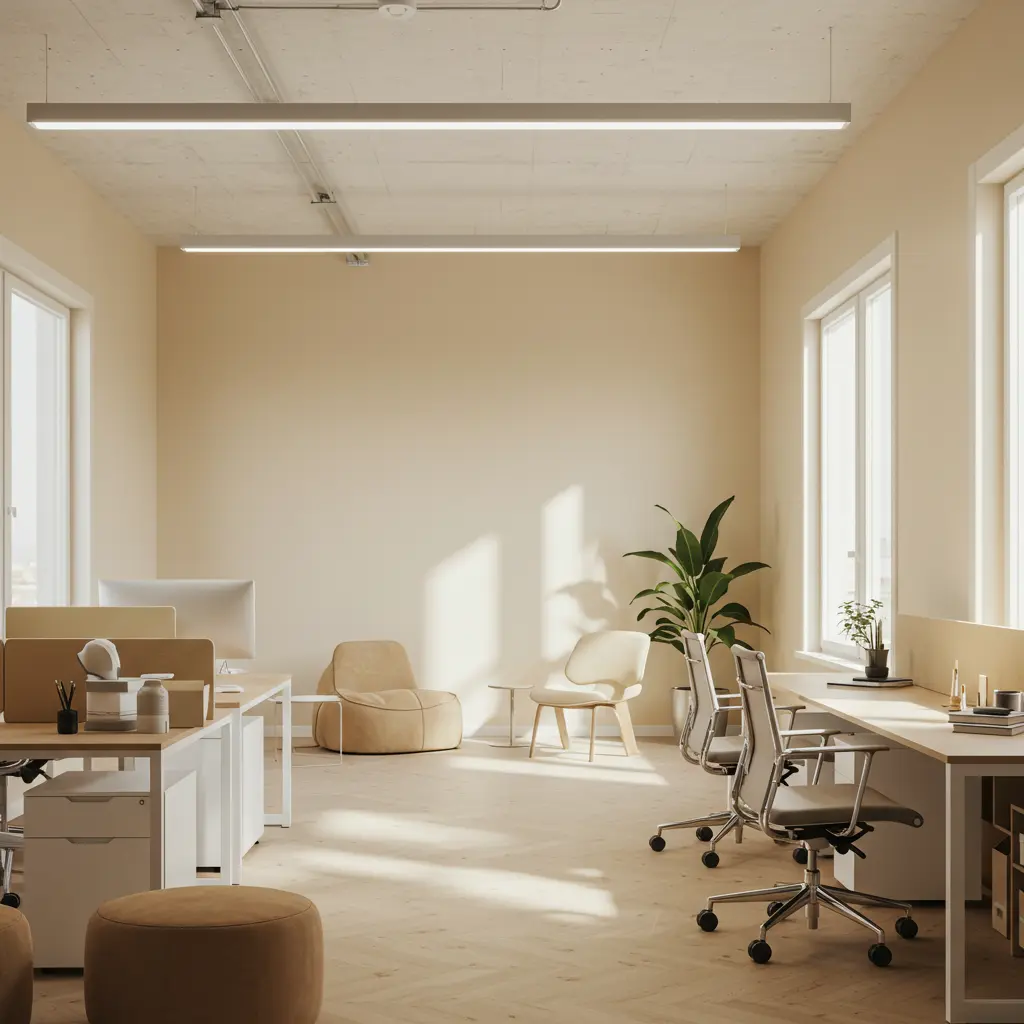
13. Natural Cream
A creamy neutral with cozy vibes. Keeps your workspace from feeling cold while still looking pro.It enhances comfort and supports collaborative energy.Warm, inviting, and smooth like your workflow.
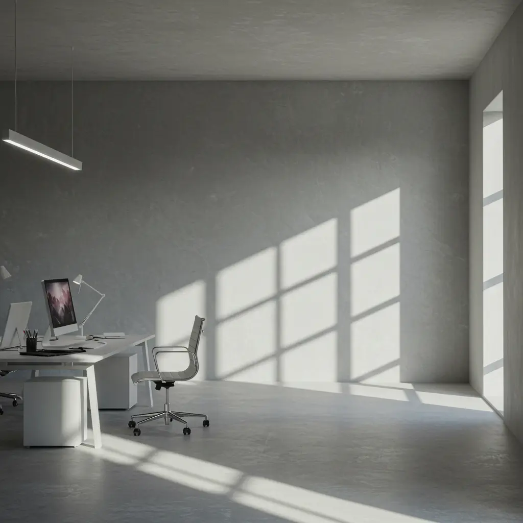
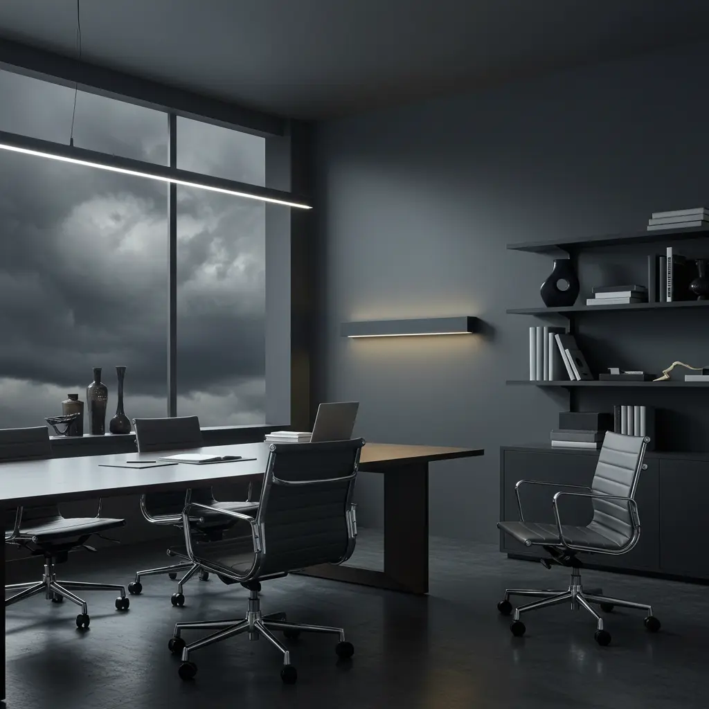
14. Iron Ore
For the brave and the bold. A dramatic dark gray that makes your office feel important, grounded, and grown-up.It defines boundaries and is ideal for high-intensity work zones.Think boss energy but painted.
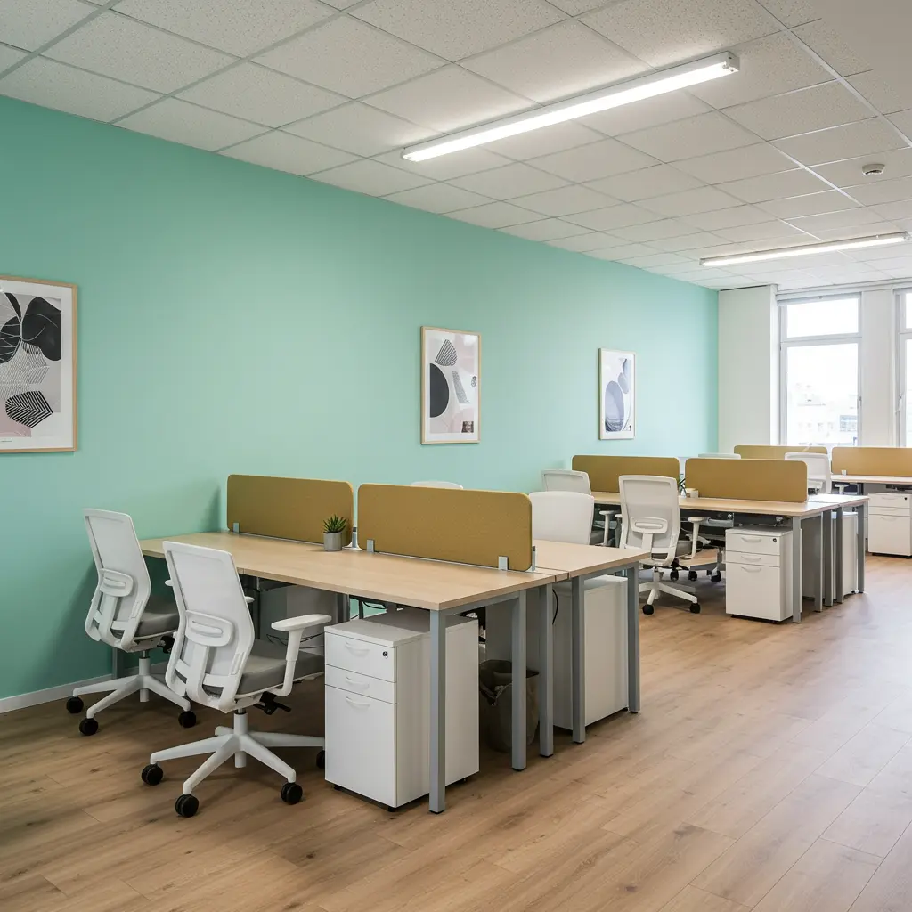
15. Hint of Mint
Cool and breezy, this pastel green is great for reducing eye strain during hours at the screen.It promotes mental clarity and is soft enough to feel relaxing, fresh enough to energize.Your eyes will thank you.
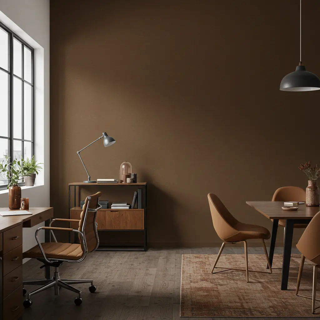
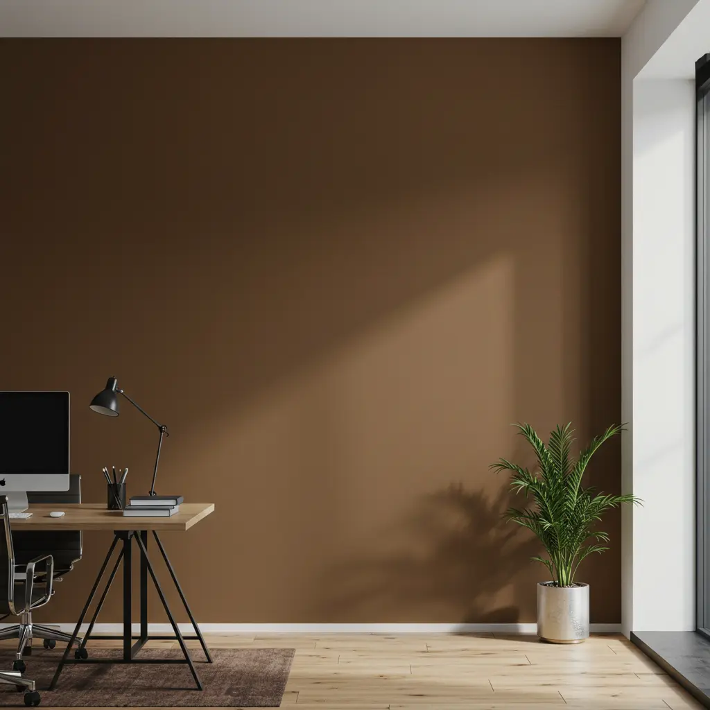
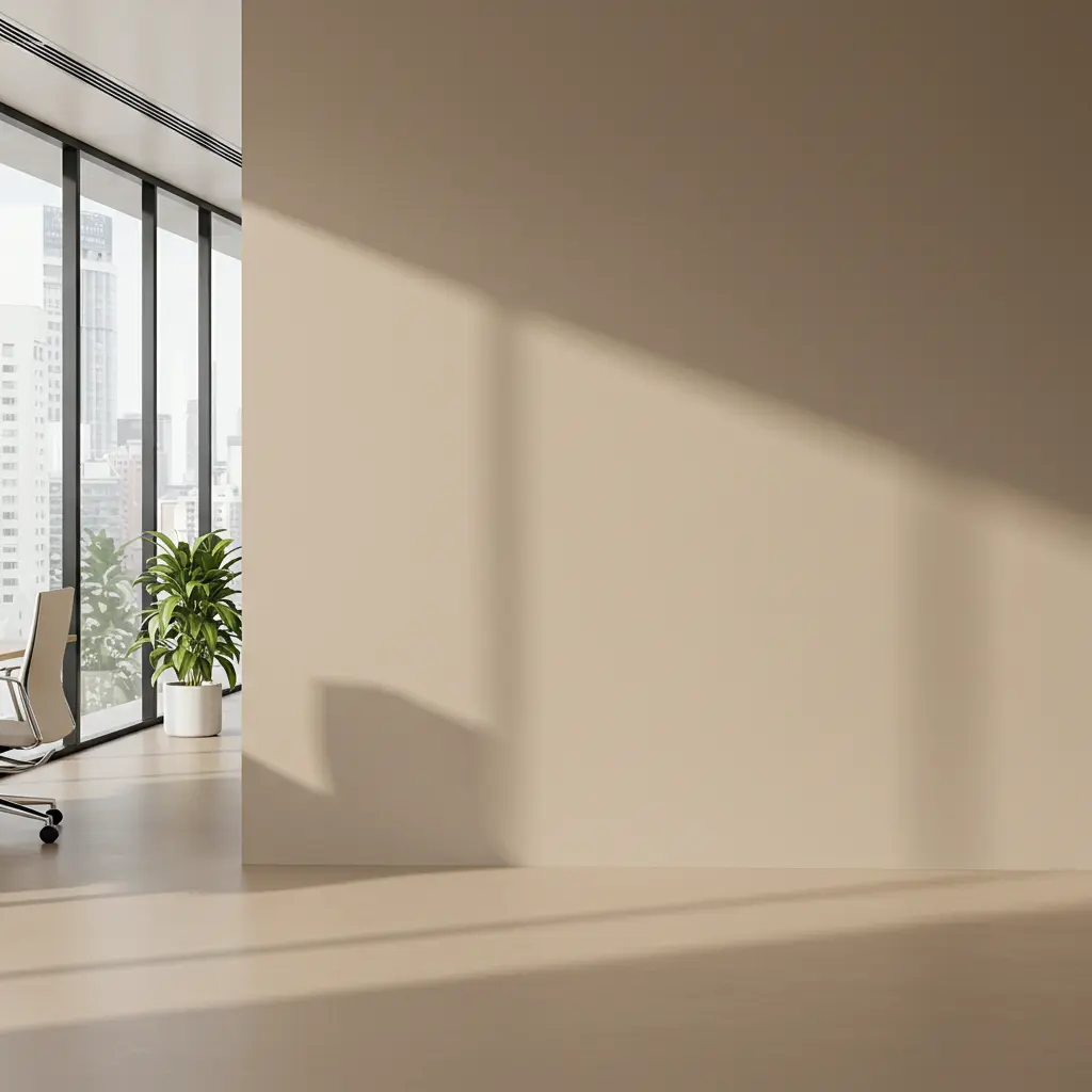
16. Urbane Bronze
A rich neutral that brings earthiness and elegance together. Especially good for home offices with natural light.It adds depth and warmth and supports confident decision-making.Grounded and elevated at the same time.
17. Celestial Blue
Bright, airy, and slightly dreamy. This one lifts your spirits and keeps you optimistic.It stimulates clear thinking and keeps mood elevated during creative work.When you need good vibes and results.
18. Antique White
Warm without being yellow, soft without being boring. A safe bet for client-facing offices.It enhances professionalism and pairs easily with wood and metal tones.Versatile, refined, and ready for anything.
19. Agreeable Gray
One of the most balanced gray-beige blends out there. It plays well with almost every accent color.It’s flexible and non-distracting and keeps visual harmony in multi-functional spaces.It’s not just agreeable it’s dependable.
20. Gentle Sky
This pale blue is like opening a window to a clear morning. It lightens the room and your mood.It encourages optimism and enhances morning energy.Your office’s built-in pick-me-up.
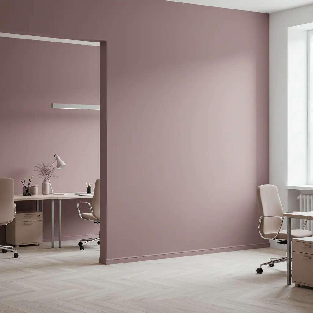
21. Dusty Mauve
Unexpected but sophisticated. Great for creative studios that need just a touch of color.It inspires originality and offers a cozy contrast to sleek furniture.Bold but balanced. Quietly expressive.
22. Soft Chamois
Almost white, with a greenish-beige undertone. It’s subtle but super impactful in brightening up tired corners.It adds freshness and minimizes distraction while uplifting the space.A gentle nudge toward your best work.
Final Thought
Your office color shouldn’t just match your vibe it should enhance it. From moody navies that spark focus to fresh greens that calm your nerves, these paint colors are your first (and maybe easiest) upgrade to a smarter, sharper work zone.
Paint isn’t just decoration. It’s productivity in a can. Now go pick your power color.And hey your best work? It starts with your walls.
