Get ready to screenshot. These aren’t just colors; they’re moods. We’ve curated the ultimate list for max impact.
Your guest room is about to become legendary.
1. Serene Sage: The Ultimate Chill Pill
This ain’t your grandma’s muted green, okay? Serene Sage is like a deep, calming breath for your walls. It’s instantly welcoming, whispering “relax, you’re home.” Perfect for guests who need to decompress after traveling.
Style-wise, it’s earthy, sophisticated, and super versatile. Works with boho, modern, or even minimalist decor. Your friends will be asking, “Is this a spa or your guest room?”
The subtle flex is real with this one. But how do you keep it from looking too… bland? The trick is in the texture and layering.
Think linen bedding, a chunky knit throw, maybe some pampas. Natural wood accents also make sage pop. It’s a grounding color that feels incredibly thoughtful. Guests will feel so cared for, they might never leave. Just kidding… mostly.
2. Whispering Wheat: Warm Hugs in a Can
Imagine the soft glow of late afternoon sun.That’s Whispering Wheat. It’s a warm, inviting neutral. It’s like a gentle embrace when your guests walk in. Instantly cozy, without being overwhelming or stuffy.
This color screams understated elegance. It’s a perfect canvas for any decor style you throw at it. “Your guest room feels so peaceful!” will be the common refrain. It’s the kind of color that just makes people sigh contentedly.
Wondering if it’s just another boring beige? Absolutely not. The secret is its subtle warmth and depth. It pairs beautifully with creamy whites and soft browns. Add a pop of muted terracotta or olive for extra chic.
Lighting plays a big role here; warm bulbs enhance its glow. It’s a timeless choice that always feels current. Your guests will feel like they’ve stepped into a calm oasis.
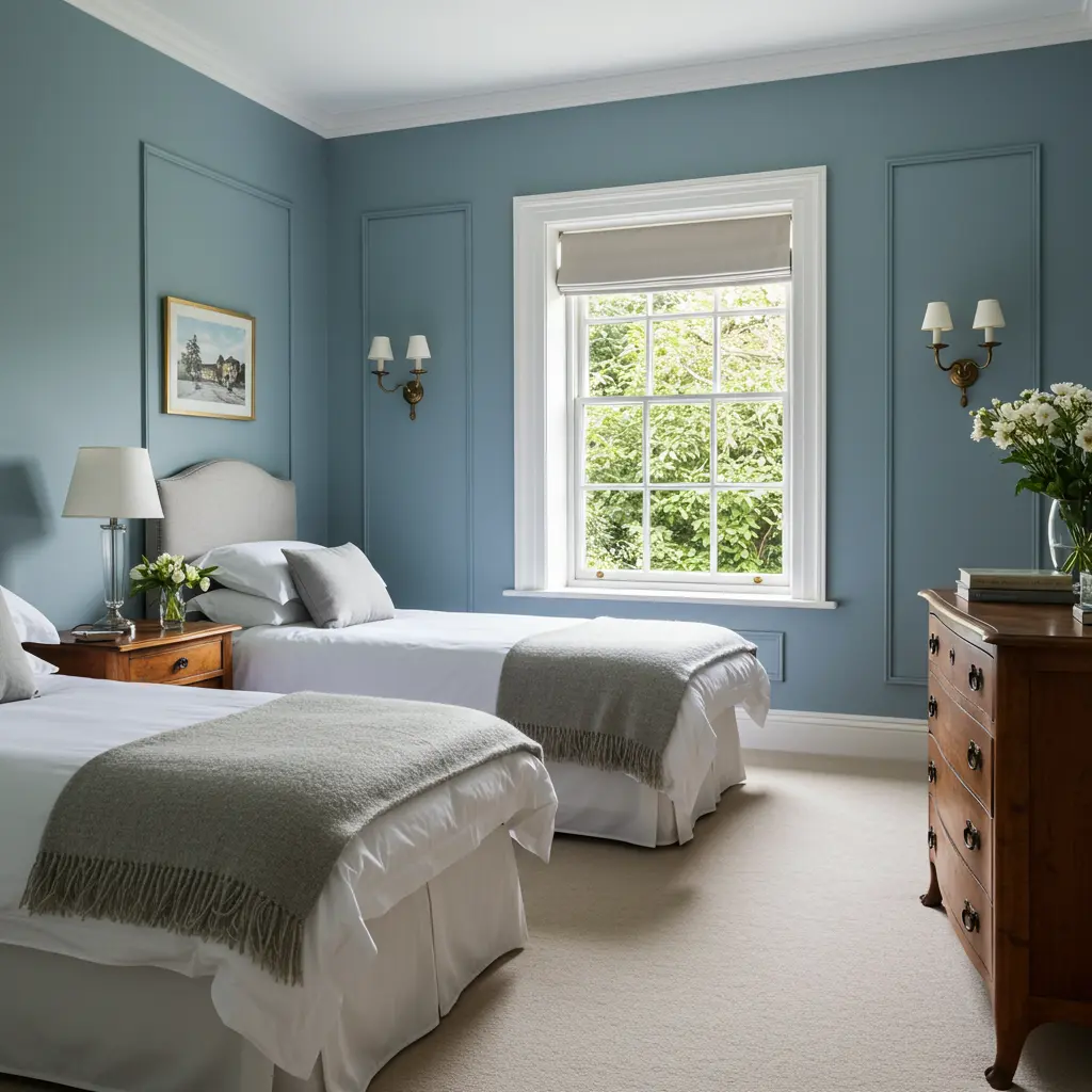
3. Dreamy Dusty Blue: Your Guests’ New Happy Place
This isn’t just blue, fam. It’s an experience. Imagine sinking into a cloud. That’s this color. It whispers “welcome” without even trying. So calming, your guests might extend their stay. Maybe.
Style points? Off the charts. It’s effortlessly chic. Think boutique hotel, but make it personal and homey. Your friends will be sliding into your DMs for the deets. “OMG, what IS that color?!” Get ready for it.
But how do you stop it from feeling too sleepy or cold? There’s a secret to balancing this dreamy hue. Pair it with warm woods for that cozy contrast. Or crisp white trim to make it really pop.
Add some metallic accents, maybe brushed gold or brass. Suddenly, it’s less nursery, more sophisticated sanctuary. This color is a total vibe shifter. It turns a spare room into a legit retreat.
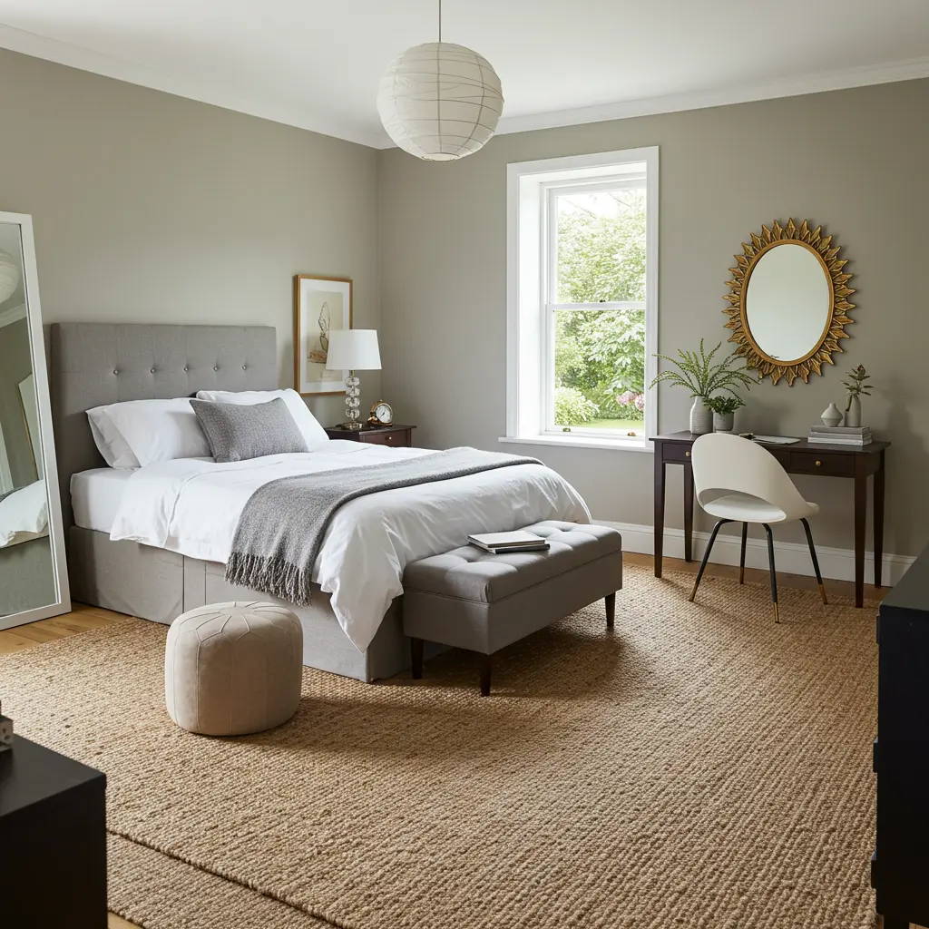
4. Cozy Greige: The Chameleon Your Room Needs
Can’t decide between gray and beige? Enter Greige. It’s the perfect hybrid, bringing the best of both worlds. This shade is the ultimate in welcoming versatility. It adapts to light, making the room feel right, day or night.
Super sophisticated, Greige is the definition of modern neutral. It lets your decor and bedding truly shine. Guests will feel like they’re in a high end, curated space. The kind of calm that encourages deep, restful sleep.
“Is it gray? Is it beige? I can’t tell, but I love it!” That’s the magic of a truly well balanced Greige. The key to making Greige pop is contrast. Think dark wood furniture or bright white textiles.
Layer different textures: velvet, linen, faux fur. It’s a foundational color that feels both trendy and timeless. Your guest room will feel balanced, peaceful, and chic.
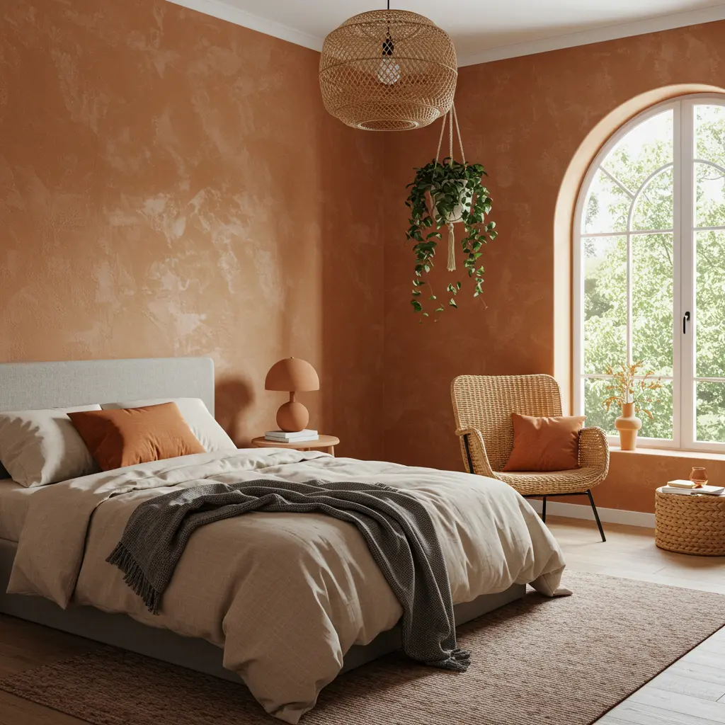
5. Sunbaked Terracotta: Desert Vibes, Max Comfort
Ready for something a little bolder, yet still inviting? Sunbaked Terracotta brings warmth and earthy richness. It’s like a welcoming desert sunset for your walls. Makes guests feel instantly grounded and a bit adventurous.
This color is a major style statement. Boho, eclectic, or even modern rustic – it slays. “This room has such amazing energy!” Yep, that’s Terracotta. It’s warm, enveloping, and surprisingly soothing.
Worried it might be too intense? Here’s the lowdown. Use it on an accent wall if you’re feeling cautious. Or, lean in and create a truly immersive cocoon. Pair it with creamy whites, deep greens, or light blues.
Natural materials like rattan and jute are its best friends. It’s a color that tells a story. Your guests will feel like they’ve escaped to somewhere special.
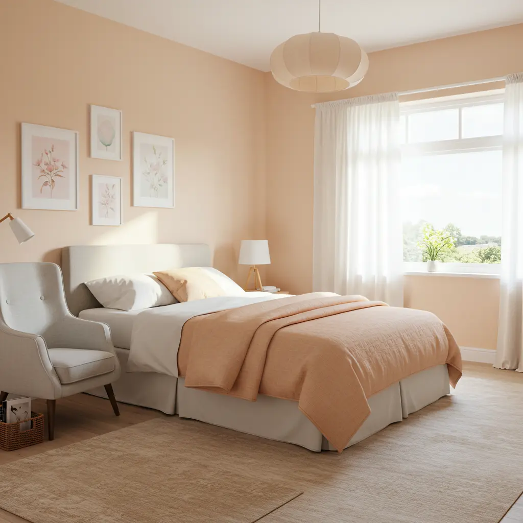
6. Soft Peach: A Gentle, Uplifting Glow
Think of the softest, most delicate sunrise. Soft Peach offers a subtle warmth that’s incredibly flattering. It’s a quiet welcome, like a friendly, knowing smile. Makes the room feel light, airy, and positive.
Style wise, it’s surprisingly sophisticated, not juvenile. It can lean vintage chic or modern minimalist equally well. Guests will notice how good the light is in the room. “Everything just looks so soft and pretty in here!”
But how to make sure it doesn’t look like a baby’s room? The secret is in the undertones and pairings. Choose a peach with more beige or gray undertones. Pair with cool grays, sage greens, or even deep blues.
Metallic accents, especially rose gold or copper, look fab. It’s a nurturing color that feels fresh and modern. Your visitors will feel rested and rejuvenated.
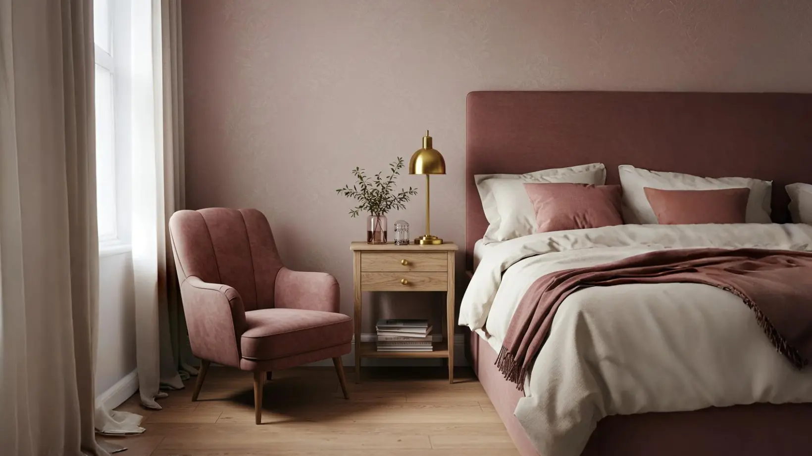
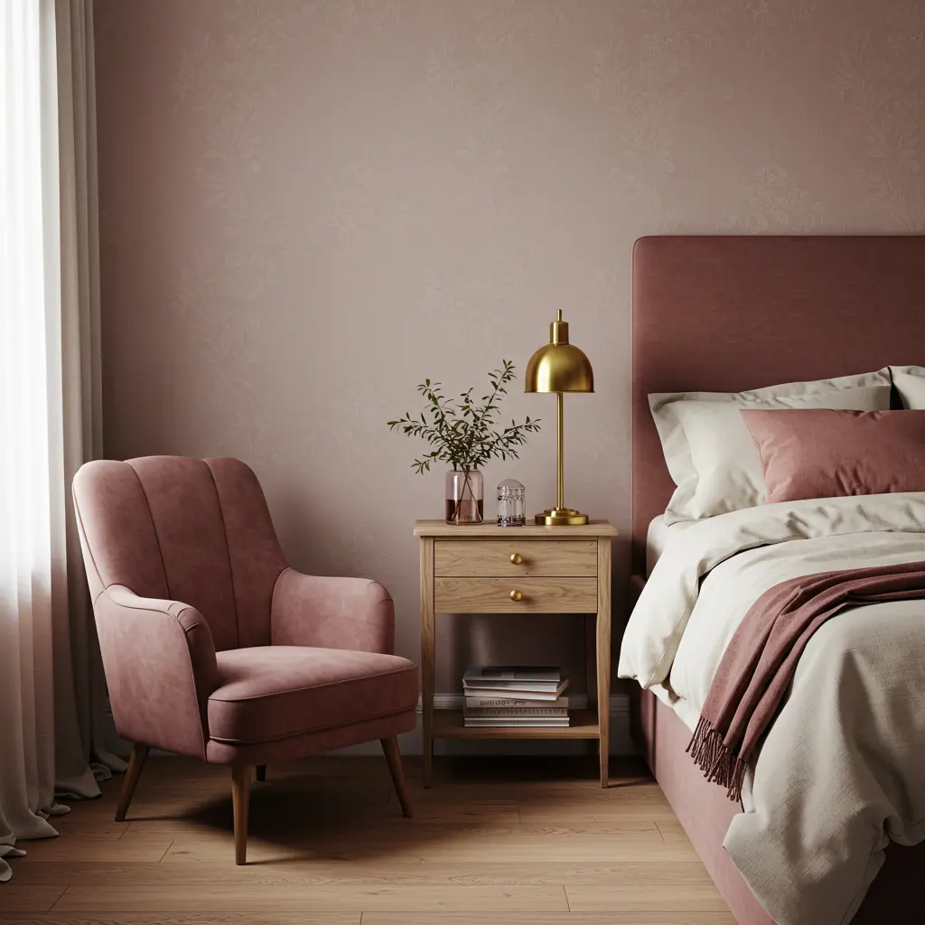
7. Dusky Rose: Vintage Charm, Modern Appeal
Dusky Rose is not your average pink. It’s sophisticated. It has a muted, almost historic quality that feels luxe. It offers a unique, warm welcome that feels personal. Like stepping into a beautifully preserved secret garden.
This color is incredibly chic and romantic. Perfect for creating a guest room with a boutique feel. “This room is so elegant! I feel like royalty.” Expect these kinds of compliments. It’s that good.
Is it too feminine? Not if you style it right. The trick is to balance its inherent sweetness. Pair with charcoals, deep greens, or rich wood tones. Incorporate industrial elements or clean, modern lines.
Linen and velvet textures add depth and sophistication. It’s a color that feels both nostalgic and very now. Your guests will feel pampered and utterly charmed.
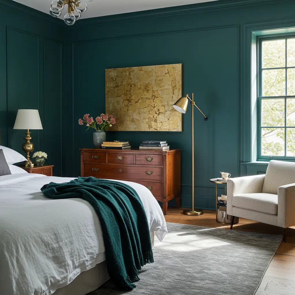
8. Deep Teal: Mysterious & Inviting Luxury
Want to make a statement? Deep Teal is your answer. It’s rich, enveloping, and screams sophisticated drama. This color welcomes guests into a jewel box experience. It feels cozy and protective, perfect for a restful night.
Style? Max impact. It’s bold, luxurious, and unforgettable. Creates an instant mood of opulence and intrigue. “Wow, this room feels like a high end hotel suite!” Get ready for your guest room to be the talk of the town.
But can a small guest room handle such a dark color? Yes, and here’s the secret to making it work. Use it in a room with good natural light if possible. Balance with light colored bedding, rugs, and art.
Metallic accents like gold or brass will shine against it. Mirrors will also help bounce light around. It’s a daring choice that pays off in major style points. Your guests will feel like VIPs in their private retreat.
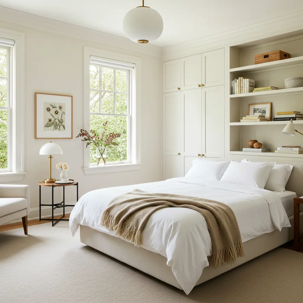
9. Warm White: The Classic Glow Up
Okay, white? Groundbreaking. But hear us out. Warm White is not stark or clinical; it’s inviting. It’s the ultimate clean slate welcome. Makes any room feel bright, airy, and spacious.
Style wise, it’s timeless and endlessly adaptable. The perfect backdrop for any decor, from minimalist to maximalist. “This room is so fresh and calming!” is the vibe. It lets your guests breathe and truly relax.
But how do you keep white from feeling boring or cold? The key is the “warm” part and the layers. Choose a white with creamy or very slightly yellow undertones.
Layer in tons of texture: knit blankets, sheepskin rugs, linen curtains. Wood accents and plants add life and warmth.
It’s all about creating a cozy, not clinical, feel. Your guests will appreciate the serene, uncluttered space.
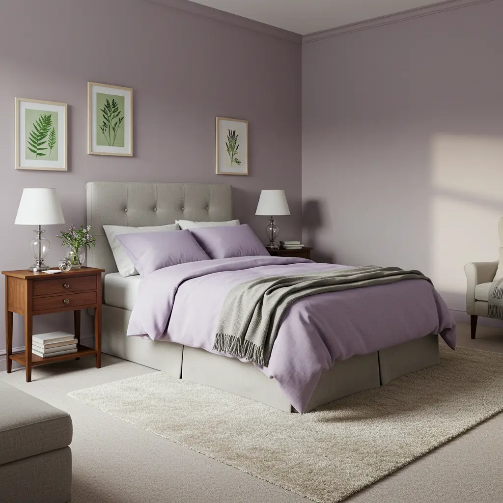
10. Gentle Lavender: A Soothing Escape
Lavender isn’t just for sachets anymore. A gentle, muted lavender can be incredibly calming. It offers a soft, dreamy welcome. Promotes relaxation and a peaceful night’s sleep.
Style wise, it’s surprisingly versatile and chic. Can lean ethereal and romantic, or cool and contemporary. “I slept so well in here! It’s so peaceful.” That’s the power of this subtly magical hue.
Worried it might look too much like a kid’s room? The secret is to choose a desaturated, grayish lavender. Pair it with cool grays, crisp whites, or even dark woods. Silver or chrome accents add a modern touch.
Avoid overly frilly decor; keep lines clean. It’s a unique choice that feels thoughtful and serene. Your guests will feel like they’re floating on a cloud.
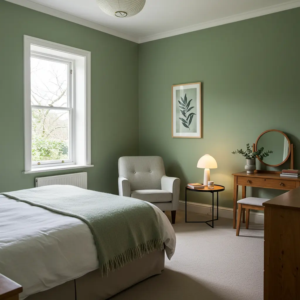
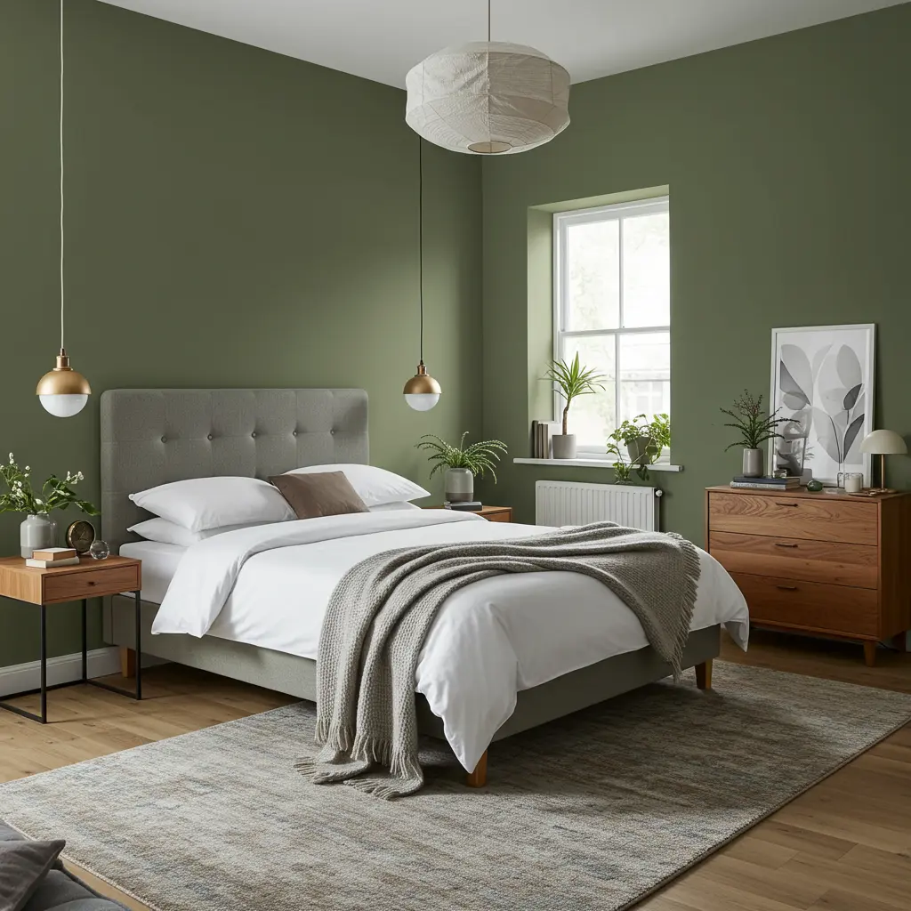
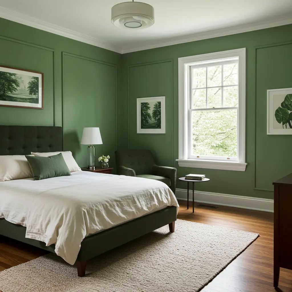
11. Muted Olive Green: Earthy & Sophisticated Sanctuary
Olive green, but make it modern and chic. Muted Olive brings the outdoors in, in the classiest way. It’s a grounding welcome, connecting guests to nature. Feels sophisticated, calming, and very current.
Style impact: huge. It’s rich, organic, and timeless. Perfect for creating a room that feels like a curated escape. “This room feels so restorative, like a modern cabin.” It’s a color that encourages unwinding and reflection.
But will it make the room too dark? Not if you balance it correctly. This is key. Use it in a room with decent light, or as an accent wall. Pair with creamy whites, beiges, or light wood tones. Leather accents and black metal details add an edge.
Lots of plants will enhance the natural vibe. It’s a sophisticated choice that feels both cozy and cool. Guests will feel instantly at ease in this earthy haven.
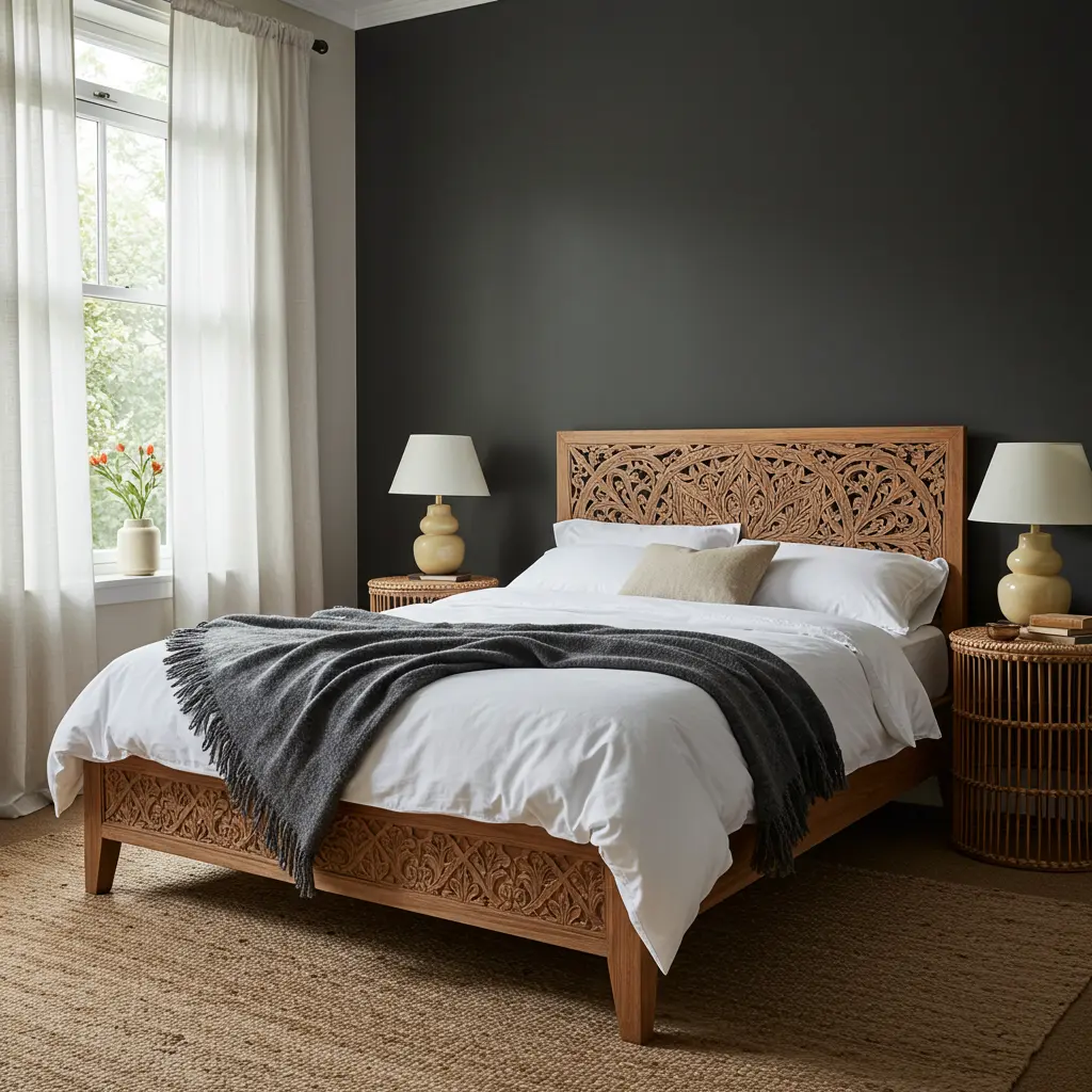
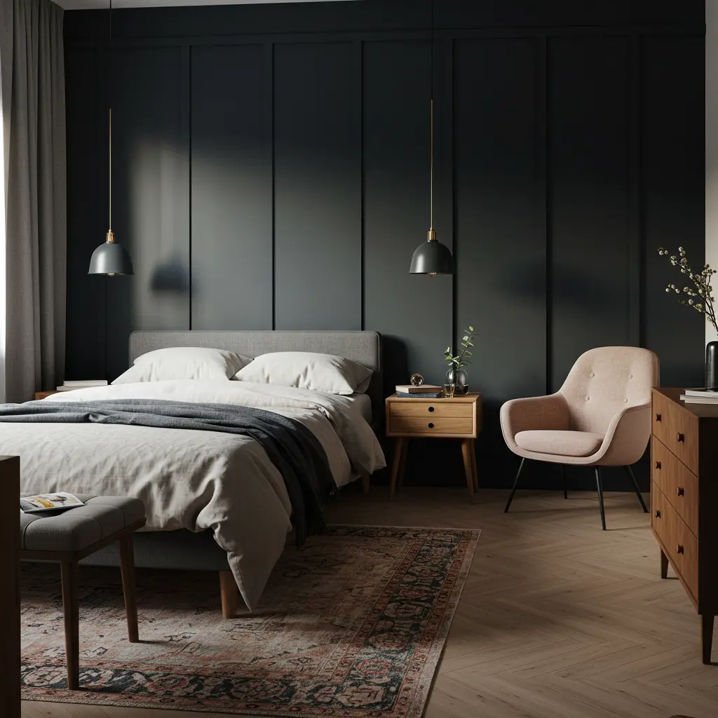
12. Rich Charcoal: Bold & Cocooning Comfort
Charcoal gray is a power move for a guest room. It’s dramatic, intimate, and surprisingly cozy. It welcomes guests into a sophisticated, cocoon like space. Perfect for encouraging deep sleep and a sense of privacy.
Style wise, it’s incredibly chic and modern. Creates a moody, luxurious atmosphere that feels intentional. “I feel like I’m in a super stylish boutique hotel!” Prepare for your guest room to feel incredibly elevated.
But won’t it be way too dark and cave like? Here’s how to nail the charcoal guest room: Best in rooms with ample natural light to avoid feeling gloomy. Use plenty of light colored bedding, rugs, and art.
Warm metallic accents (gold, brass, copper) pop beautifully.Mirrors are your best friend to reflect light.
Layer textures like velvet and faux fur for added luxe. It’s a bold choice that creates an unforgettable, cozy retreat.
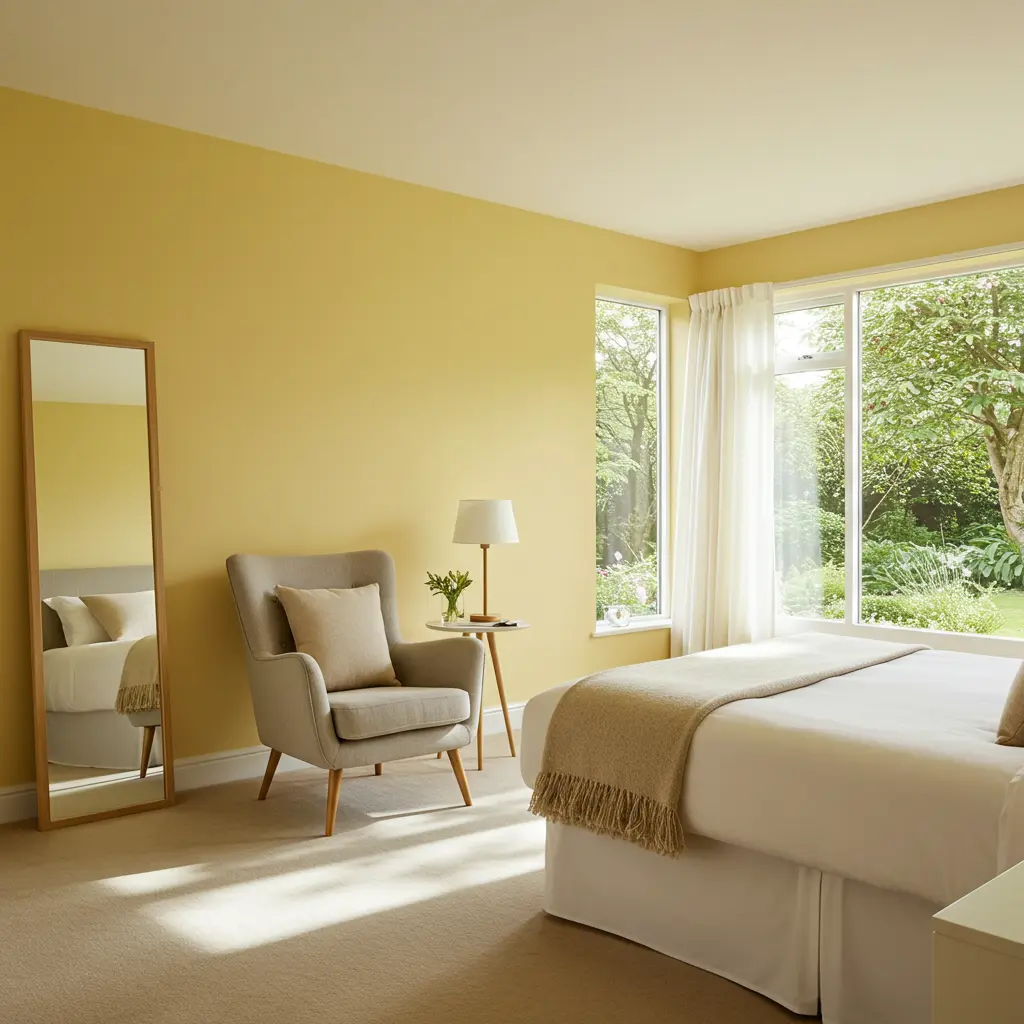
13. Buttery Yellow: A Hint of Sunshine
Not glaring yellow, but a soft, buttery, optimistic hue. It’s like a gentle infusion of happiness. This color offers a cheerful and uplifting welcome. Instantly brightens the room and the guest’s mood.
Style wise, it can be charmingly retro or surprisingly modern. Depends entirely on your decor and accent choices. “This room just makes me smile! It’s so cheerful.” It’s a dose of positivity your guests will appreciate.
How do you use yellow without it being overwhelming? The key is the “buttery” – soft and muted. Use it as an accent wall or in a room with lots of white. Pair with soft grays, blues, or even lavender for sophistication.
Natural wood tones complement it beautifully.It’s perfect for smaller guest rooms or those lacking natural light. Your guests will feel a sense of lighthearted joy.
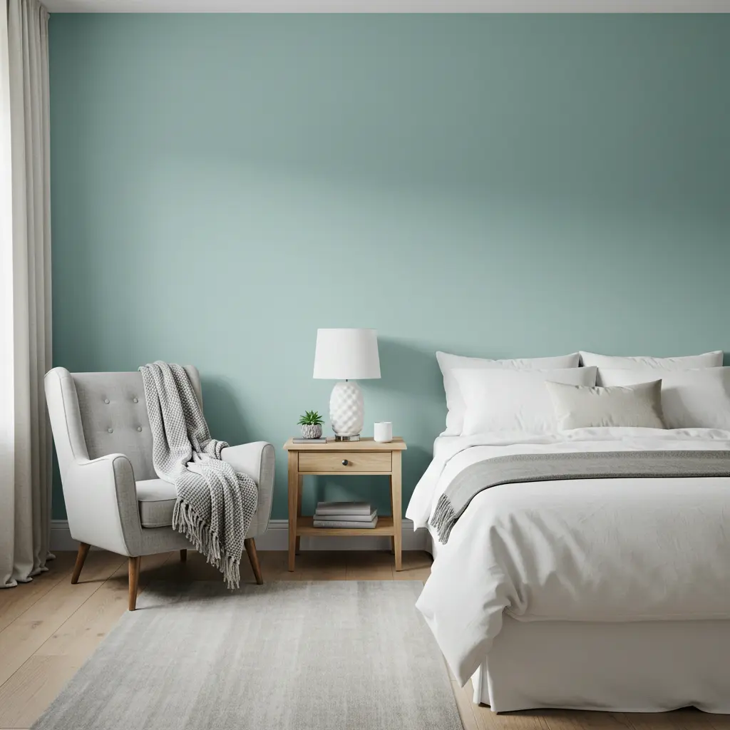
14. Pale Aqua: Coastal Calm, Anywhere
Bring the soothing vibes of the coast to your guest room. Pale Aqua is light, airy, and instantly refreshing. It’s a serene welcome, like a gentle sea breeze. Makes guests feel relaxed and on vacation, even if they’re not.
Style points for being fresh, clean, and versatile. Works for coastal, modern, or even spa like aesthetics. “This room feels like a breath of fresh air! “It’s the perfect antidote to travel stress.
But how do you avoid it looking like a bathroom color? Focus on sophisticated pairings and textures. Pair with crisp whites, sandy beiges, or soft grays. Natural textures like jute, rattan, and linen are essential.
Weathered wood accents add to the coastal charm. Keep the decor light and uncluttered for an airy feel. Your guests will feel instantly transported and tranquil.
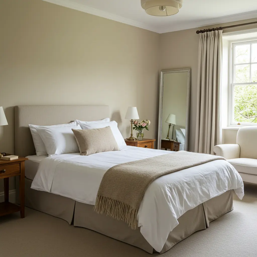
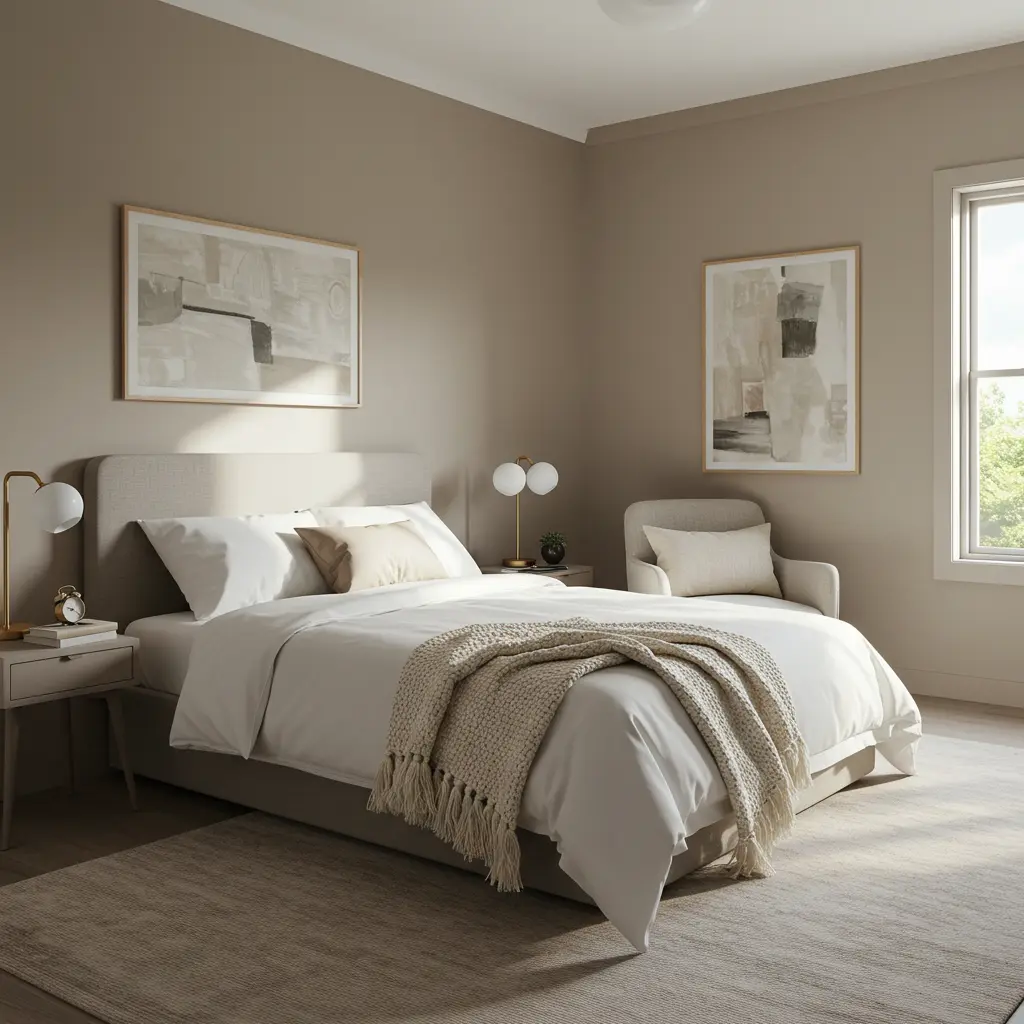
15. Taupe Temptation: The Elevated Neutral
Taupe is beige’s more sophisticated older sibling. It has a depth and warmth that feels incredibly luxe. It offers a refined and comforting welcome. Creates a sense of calm stability and understated elegance.
Style wise, taupe is a timeless classic for a reason. It’s incredibly versatile and always looks expensive. “This room feels so serene and put together.” It’s a color that speaks of quiet confidence.
Is taupe just another name for boring? Not a chance. The magic is in its subtle undertones and rich feel. Look for taupes with pink, gray, or lavender undertones. Layer with different shades of cream, brown, and gray.
Metallic accents like brushed nickel or bronze add polish. It’s a perfect backdrop for showcasing art or beautiful textiles. Your guests will feel enveloped in understated luxury.
16. Midnight Ink: The Daringly Dreamy Dark
Think the deepest, darkest blue, almost black. Midnight Ink is for the bold, creating an immersive experience. It’s an unexpectedly cozy welcome, like a starry night. Encourages deep, uninterrupted sleep and a sense of escape.
Style? Pure drama and sophistication. Creates a memorable, high-impact room that feels very intentional. “Sleeping in here was like being wrapped in velvet!” It’s a daring choice that provides ultimate comfort.
But won’t it make the room feel like a tiny black box? Strategic lighting and accents are absolutely crucial. Best for rooms with good light sources, natural or artificial. Use bright white bedding and light colored accessories to contrast.
Lots of reflective surfaces: mirrors, metallic decor. Consider a feature wall if a whole room feels too much. It’s a commitment, but the payoff is a uniquely restful haven. Your guests will rave about the unique, cocooning vibe.
17. Forest Canopy Green: A Deep Dive into Nature
Imagine the rich, deep green of a dense forest. This color is grounding, restorative, and truly immersive. It’s a profound welcome, inviting guests to reconnect. Feels like a protective embrace from the natural world.
Style impact: sophisticated, moody, and very on trend. Creates a biophilic design feel that’s incredibly calming. “I feel so connected to nature in here. It’s amazing.” This color brings the tranquility of the outdoors in.
Is it too dark for a typical guest room? It can be, so balance is key to its success. Pair with light wood tones, creamy whites, and natural fibers. Brass or gold accents will add a touch of luxe.
Ensure good lighting to prevent it from feeling somber. Lots of plants will amplify the forest feel. It’s a bold choice that makes a strong, calming statement. Your guests will feel like they’re in a chic woodland retreat.
18. Champagne Shimmer: Subtle, Elegant Glam
Not quite beige, not quite gold. It’s an effervescent neutral. Champagne Shimmer adds a touch of understated glamour. It’s a sophisticated welcome, hinting at luxury. Makes the room feel bright, warm, and special.
Style wise, it’s effortlessly elegant and very chic. Adds a subtle sparkle without being overtly flashy. “This room feels so light and luxurious!” It’s the perfect backdrop for a pampering stay.
But how do you make it glam, not just… off white? The secret is in the sheen and the company it keeps. Consider a paint with a very subtle satin or eggshell finish. Pair with textures like silk, velvet, and faux fur.
Mirrored furniture or metallic accents enhance the shimmer. Crystal or glass lighting fixtures add to the glam. It’s a refined choice that makes guests feel celebrated. Your guest room will have a quiet, five star hotel vibe.
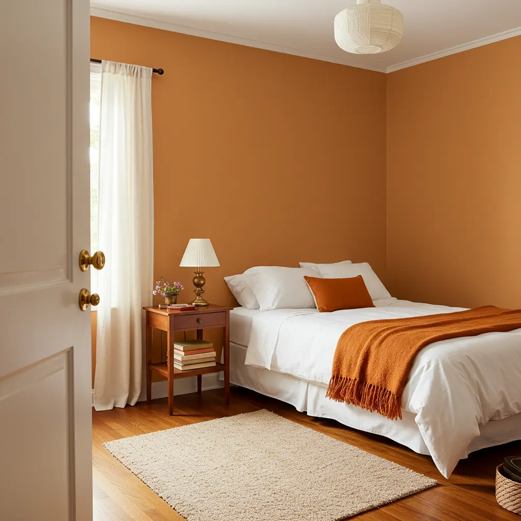
19. Spiced Pumpkin: Cozy Autumnal Allure
Think of the warm, inviting glow of autumn. Spiced Pumpkin is rich, comforting, and full of character. It’s a hearty, enveloping welcome, like a warm hug. Makes guests feel instantly cozy and at home.
Style wise, it’s bold, earthy, and surprisingly versatile. Perfect for rustic, boho, or even modern farmhouse aesthetics. “This room is so cozy! I love the warm color.” It’s a color that radiates hospitality and comfort.
Will this color be too intense or seasonal? Not if you choose the right shade and balance it. Opt for a muted, earthy pumpkin, not a bright orange. Pair with creams, browns, deep greens, or even blues.
Natural wood and textured fabrics soften the impact. It can be a stunning accent wall or a full room statement.
Your guests will feel wrapped in warmth and cheer. It’s a memorable choice that feels both unique and inviting.
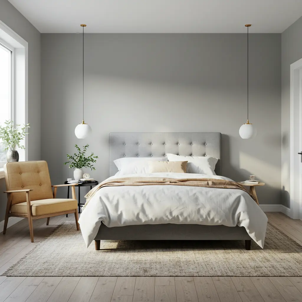
20. Cloud Gray: Light, Airy, & Modern Serenity
A very light, almost ethereal gray. Cloud Gray offers a modern take on serene neutrality. It’s a gentle, unobtrusive welcome. Makes the room feel spacious, calm, and clean. Style wise, it’s minimalist chic at its best.
A perfect canvas for contemporary or Scandinavian design. “This room is so peaceful and uncluttered. I can really relax.” It promotes a sense of clarity and calm. Is it just another boring gray? No way.
The key is its lightness and subtle coolness. Pair with crisp whites for an ultra clean look. Add pops of black for graphic contrast. Blonde wood tones and soft pastels also work well.
Focus on simple lines and minimal clutter. It’s a sophisticated choice for a modern, restful escape. Your guests will appreciate the airy, tranquil atmosphere.
Conclusion: Your Guest Room’s New Era of Awesome
So there you have it. The ultimate guide to guest room paint. It’s more than just color; it’s about creating an experience. A space where your visitors feel truly welcomed, comfortable, and special.
These colors aren’t just trendy; they’re designed to evoke feeling. To make your guests say “wow” and mean it. And yeah, to make their friends a little jealous of their stay.
Choosing the right paint is your first step to becoming a legendary host. Now go pick your perfect shade and get ready for the compliments. Your guest room glow up is officially pending. You got this.
