Movie night is sacred. It’s that magical time when you sink into a comfy seat, grab your popcorn, and fully escape into another world. But guess what?
The color of your media room could be killing the vibe.
Yep, the wrong shade on your walls can mess with your picture quality, mood, and even sound perception.
But don’t panic we’re diving deep into the best paint colors that’ll turn your media room into a cinematic masterpiece.
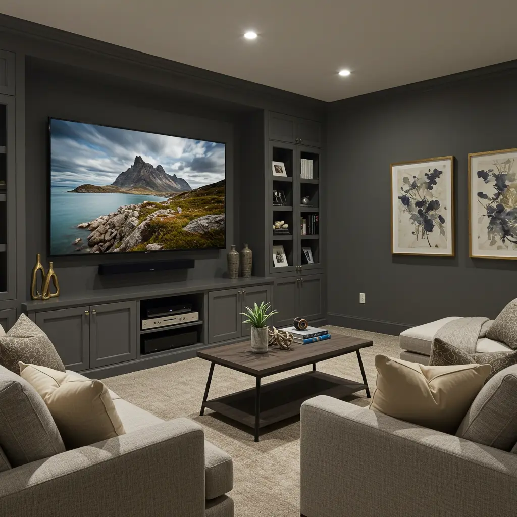
Why Paint Color Even Matters in a Media Room
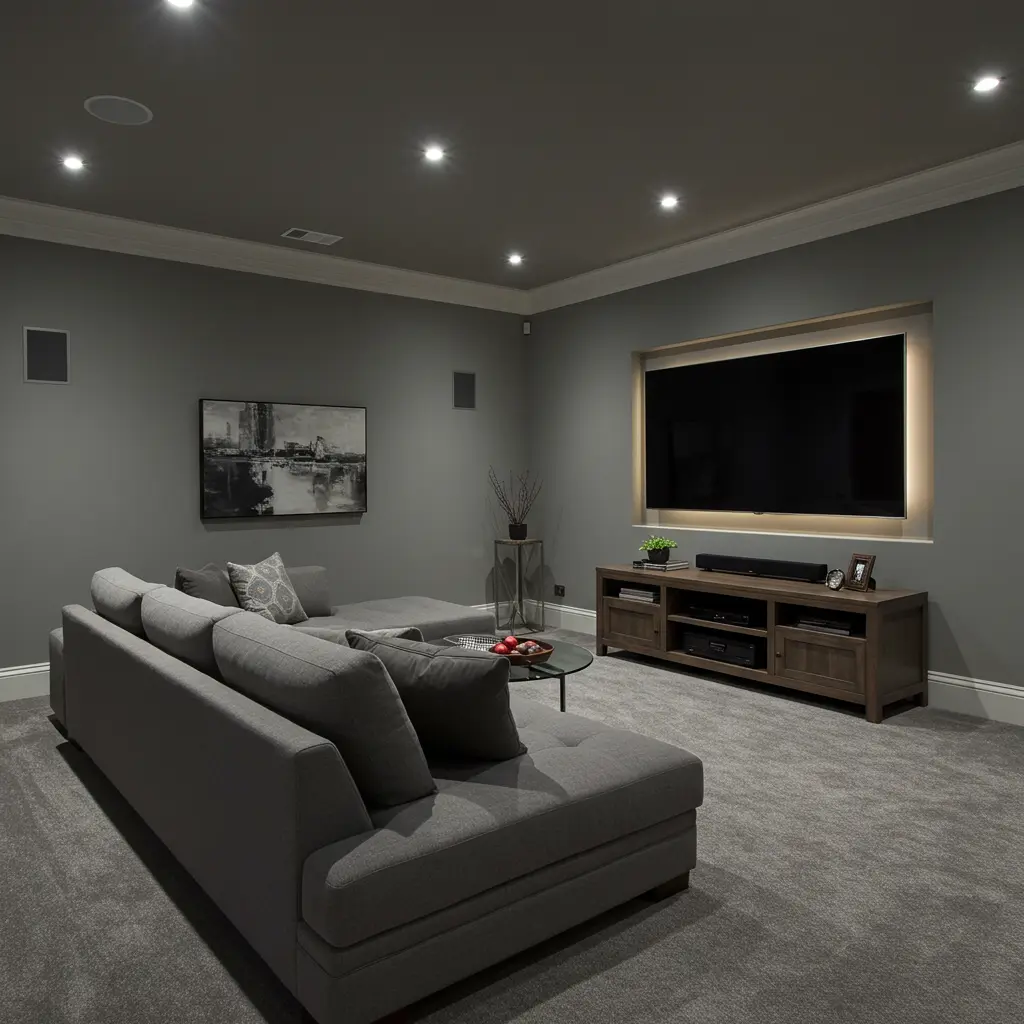
Let’s keep it real. Your 4K projector and surround sound setup are only as good as the space around them.
Paint color affects light reflection, ambiance, and immersion. Darker colors reduce glare and make the visuals pop.
Plus, the right tone sets the mood whether you’re watching horror, rom-coms, or a full Marvel marathon.
So before you hit play, let’s get your paint game on point.
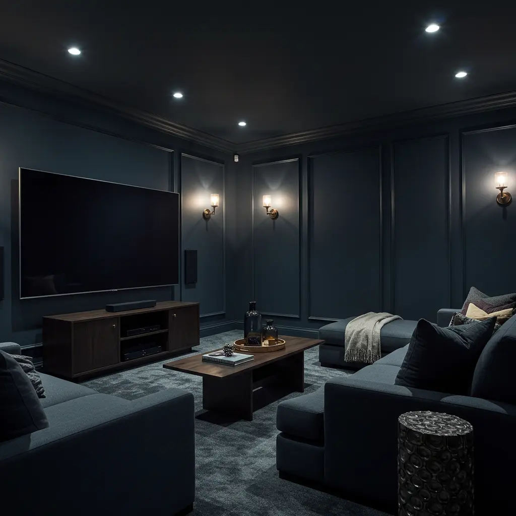
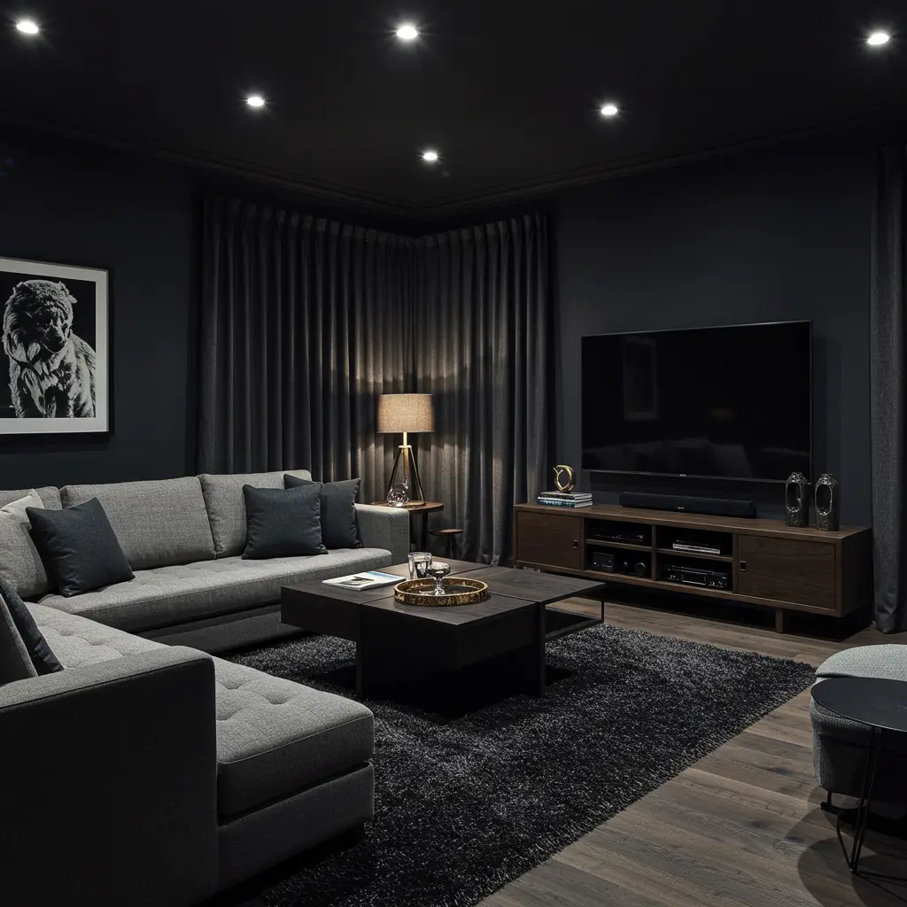
1. Tricorn Black by Sherwin-Williams
Black paint, but make it luxe. Tricorn Black is rich, velvety, and ideal for full immersion.
It absorbs light like a sponge, keeping distractions to a minimum and visuals at peak crispness.
Use matte or flat finishes. Gloss is not your friend here.
2. Deep Space by Benjamin Moore
If you want black but not too black, Deep Space is your guy.
It’s a dark charcoal that screams sophistication.
It works great for smaller media rooms where full black might feel too heavy.
Pair it with deep navy accents for a galaxy-core vibe.
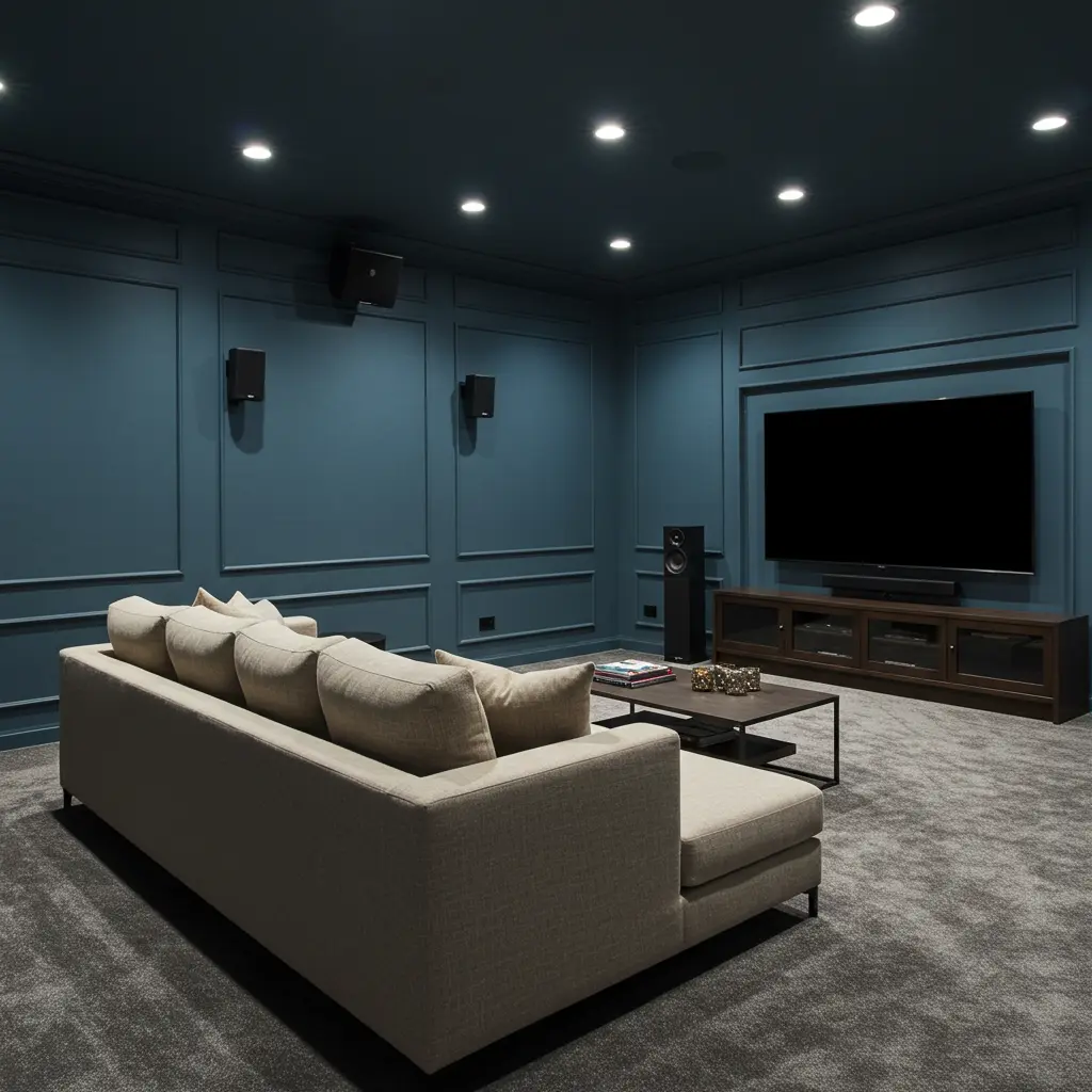
3. Hale Navy by Benjamin Moore
This one’s a Gen Z favorite. It’s bold, moody, and totally Instagrammable.
Plus, it gives you that theater feel without going full blackout.
Gold sconces + Hale Navy = chef’s kiss aesthetics.
4. Iron Ore by Sherwin-Williams
Not quite black. Not quite gray. Just dramatic enough.
Iron Ore feels moody and cozy. And it plays nice with warm LED lighting.
Paint the ceiling too for full cocoon energy.
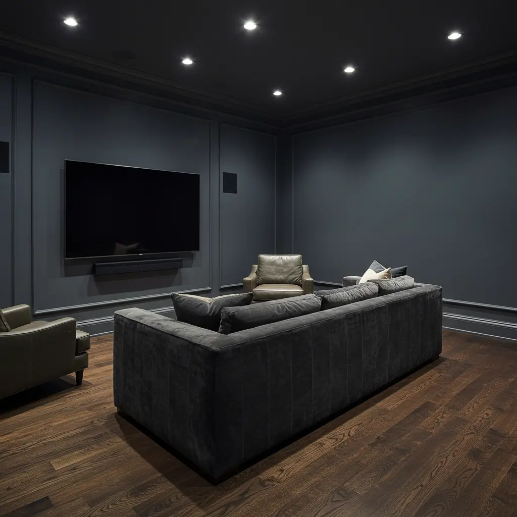
5. Kendall Charcoal by Benjamin Moore
Sleek, smoky, and classy AF. Kendall Charcoal turns any room into a cinema lounge.
And it won’t make the room feel like a cave.
Velvet curtains in wine or emerald green? Yes, please.
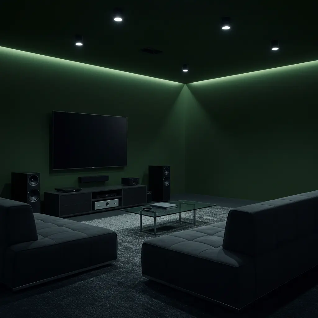
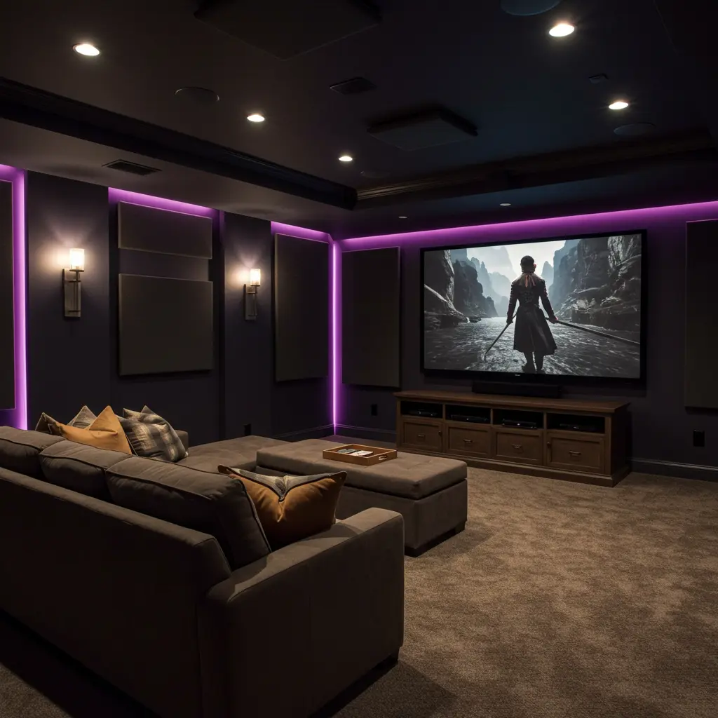
6. Greenblack by Sherwin-Williams
As cool as it sounds. It’s a hybrid between green and black.
It’s a bold move but pays off big in mood and ambiance.
Light a scented candle and thank us later.
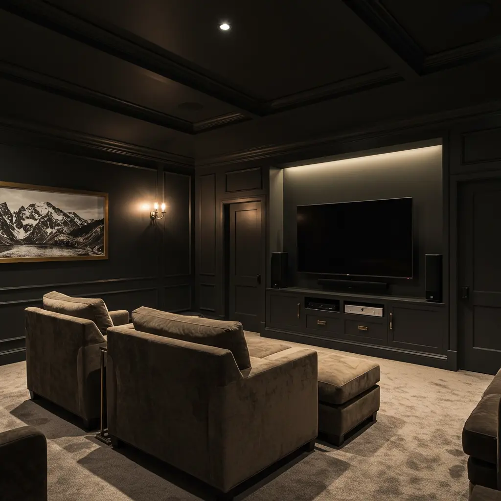
7. Wrought Iron by Benjamin Moore
Understated elegance. It’s deep, dark, and subtly warm.
Perfect if you want something cinematic but a little less stark than jet black.
Add textured wall panels for that VIP screening room feel.
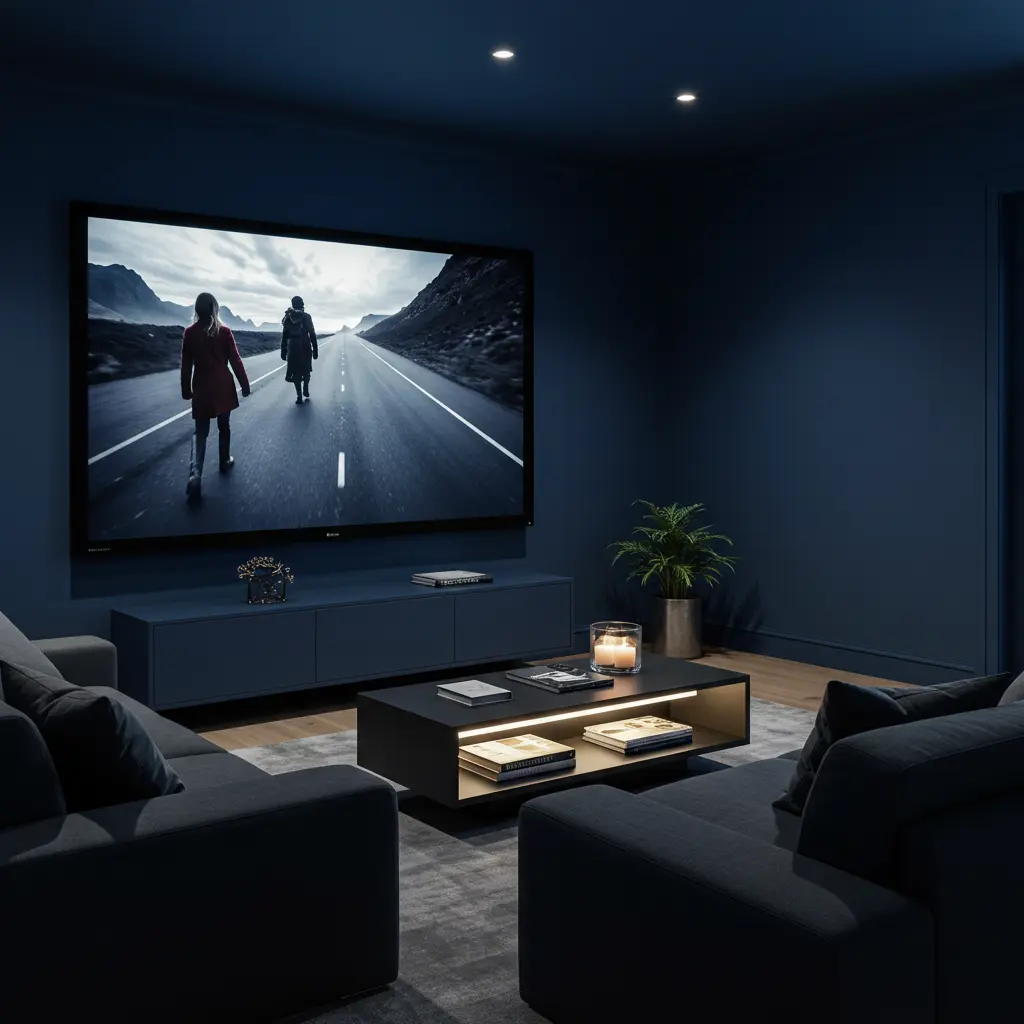
8. Nightfall by Benjamin Moore
This is what a Netflix binge looks like in color form.
It’s deep navy with a smoky undertone. Ideal for calming your mind before the show starts.
Projectors love this shade.
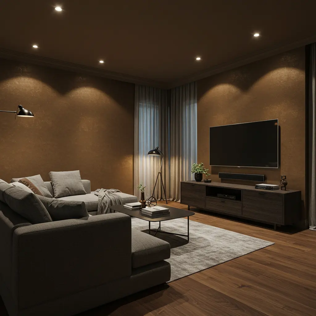
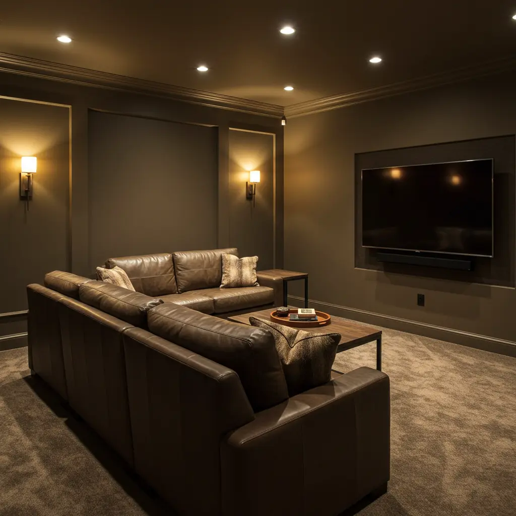
9. Urbane Bronze by Sherwin-Williams
A dark, warm bronze-gray. It’s like wrapping your media room in a designer throw blanket.
Moody and luxe without trying too hard.
It won Color of the Year for a reason. Try it and flex.
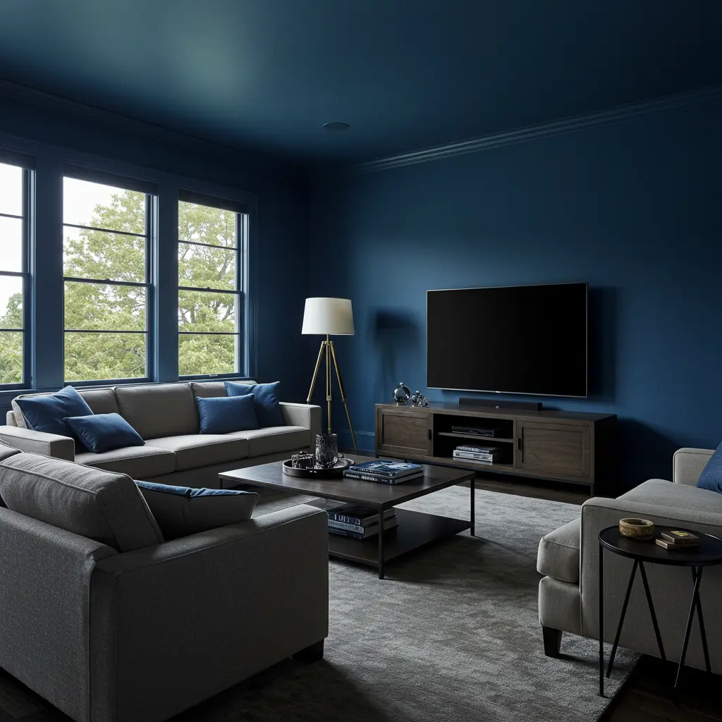
10. Naval by Sherwin-Williams
Yes, more navy. But this one’s got a royal vibe.
It brings intensity without overwhelming the senses.
Add LED strip lights behind your screen for contrast drama.
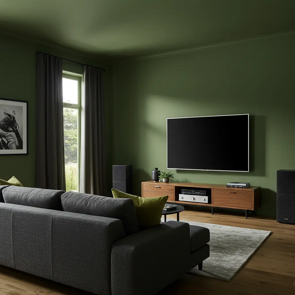
11. Ashwood Moss by Benjamin Moore
Into dark greens? This one’s giving forest at midnight.
Calming, deep, and full of character.
Try a tan leather recliner against it. Jaw drop guaranteed.
12. Obsidian by Glidden
Mysterious and matte. Obsidian makes your space feel like a secret cinema club.
It’s the paint version of a plot twist.
Low lighting looks 🔥 against this shade.
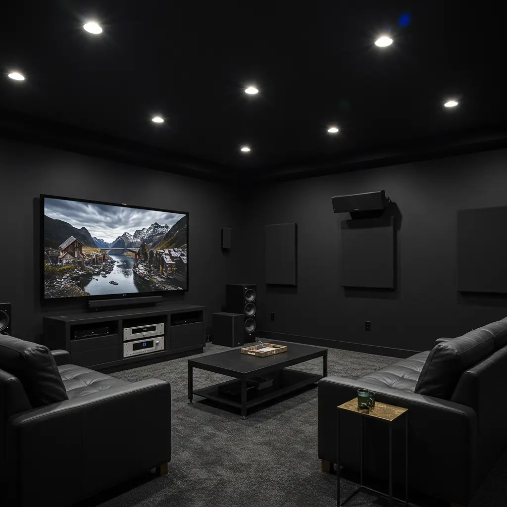
13. Soot by Benjamin Moore
Yeah, the name’s intense, but the color is smoother than it sounds.
A cool black that delivers deep ambiance without feeling gloomy.
Accent with burnt orange pillows or artwork.
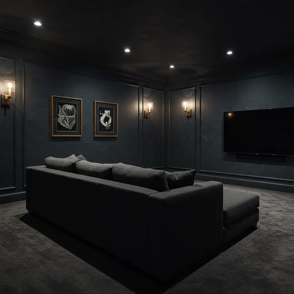
14. Shadow by Benjamin Moore
This one is dramatic with purple undertones. Low-key regal.
For anyone wanting a hint of mystery without full gothic energy.
Your room will look different depending on the lighting. Mood chameleon.
15. Dark Pewter by Benjamin Moore
An edgy dark gray with blue hints. Think sophisticated tech-vibe.
It’s the Elon Musk of paint colors: futuristic but grounded.
Use black-out shades to maximize the effect.
16. Black Fox by Sherwin-Williams
Brown-black with moody energy. Think dark roast coffee but on walls.
It’s warm, chill, and shockingly versatile.
Layer with copper or brass decor for that rich-home-theater feel.
17. French Beret by Benjamin Moore
Sleek Parisian vibes. This navy-gray mix is subtle but adds so much class.
It’s perfect if you’re going for a minimalist noir aesthetic.
White projector screens pop against this shade.
18. Black Magic by Sherwin-Williams
Not just a cool name it’s actual sorcery for your media room.
Deep black that’s elegant instead of harsh.
Go for plush rugs and tiered lighting for ultimate movie palace energy.
19. Raccoon Fur by Benjamin Moore
Yes, the name is chaotic. But the color is pure drama.
It’s a smoky blue-black with insane depth.
Works beautifully in both small and large spaces.
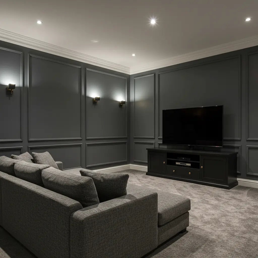
20. Web Gray by Sherwin-Williams
A medium-dark gray that’s modern and ultra flexible.
Great for shared spaces or multipurpose rooms.
Add smart lighting that changes color during your watch party.
Final Popcorn Thoughts: Choose Your Paint Like You Choose a Movie
Picking a media room color is all about creating a vibe. Go dark for full immersion, play with navy for moodiness, or try smoky greens for a rich, cozy look.
The goal? A space that makes you forget about your phone and fully lock into the story.
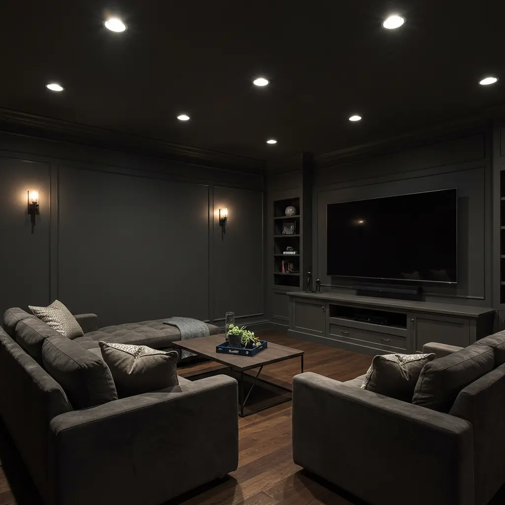
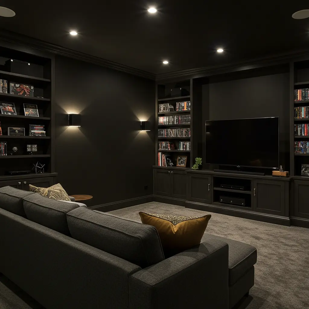
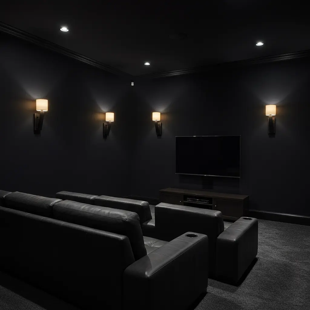
Extra Credit: Pro Tips to Level Up Your Media Room
- Paint the ceiling the same color as the walls for a seamless feel.
- Use LED backlighting behind your screen to reduce eye strain.
- Install blackout curtains. Natural light is the enemy.
- Go matte or flat finish. Always.
- Add acoustic panels for sound magic.
- Keep the snacks fancy. Truffle popcorn, anyone?
Now go pick a shade, light a candle, and press play. Your binge-watching deserves a backdrop that slays.
Lights off. Let’s roll.
