Is your phone background still stuck in summer? Just a generic photo on a bright screen, not quite capturing the spooky shift in the air? You’re in the right place to change that.
A wallpaper shouldn’t just be a picture; it should be the mood board for your season, a backdrop for late-night scary movies, cozy autumn evenings, and a month of delightful frights.
This is your creative playbook for transforming that screen into a feature that’s not only stylish and atmospheric but feels deeply, personally you.
We’ll explore eerie designs, decode the secrets of the spooky aesthetic, and find the perfect image to bring it all to life.
By the end, you’ll see your screen not as a utility, but as a pocket-sized portal to your own Halloween story.
Before You Begin: Dreaming Up Your Perfect Spooky Vibe
The most beautiful aesthetics start with a little bit of soul-searching, not just a frantic image search.
Before you download a single pixel, let’s lay the groundwork for a look you’ll love all October long. Are you going for a cute, retro spookiness, a genuinely chilling horror vibe, or a sophisticated gothic elegance?
The Secrets of Style: Simple Rules for a Stunning Look
Design theory sounds intimidating, but it’s really just about what makes an image feel right. Here are a few simple secrets for the perfect Halloween wallpaper:
Getting the Scale Right: The main subject of your wallpaper should feel at home on your screen, leaving room for your app icons and widgets.
- For a busy home screen: Choose a repeating pattern or a design with lots of negative space where your icons can live peacefully.
- For a clean lock screen: Go for a bold, centered image like a single, dramatic jack-o’-lantern.
Creating Balance: A glowing pumpkin is a strong visual statement. You can balance it in two ways:
- Symmetrical Balance: Think of a haunted house perfectly centered under a full moon. This creates a powerful, formal, and classic horror feeling.
- Asymmetrical Balance: Imagine the silhouette of a gnarled tree creeping in from the right side of the screen. This feels more modern, dynamic, and unsettling.
The Spooky Color Story: We’re focusing on the ultimate Halloween duo: orange and black.
- 60% is your dominant color: a deep, inky black. This creates the moody, dark aesthetic and makes your icons legible.
- 30% is your secondary color: a vibrant, glowing orange. This is for your subject the pumpkins, the autumn leaves, the eerie glow in a window.
- 10% is your accent: think pops of white or smoky grey for moonlight, fog, or ghostly apparitions.
Let the Star Shine: Decide if the wallpaper is the main event or a subtle backdrop. An intricate, illustrated scene is the hero. A simple, textured black background with a tiny orange pumpkin is the supporting actor that lets your customized widgets take center stage.
The Wallpaper Toolkit: From Download to Display
| The Approach | Where to Look | What You Get | The Little Extras (Don’t Skip These!) |
| The Quick Find | Pinterest, Unsplash, Zedge | • Thousands of free, ready-to-use wallpapers • Instant seasonal gratification | • The screenshot tool for quick cropping • Your phone’s built-in “blur” feature |
| The Curated Search | Behance, ArtStation, Instagram (#halloweenaesthetic) | • Unique art from independent creators • A more artistic, less “stock” feel | • Following your favorite artists • Reaching out to ask for a phone-sized version |
| The Custom Creation | Canva, Procreate, AI Art Generators (Midjourney) | • A 100% unique wallpaper made by you • Perfect resolution and composition | • Widget customizer apps (Widgetsmith) • Custom icon packs (from Etsy) |
The Wallpaper Gallery: Finding Your Signature Spook
Here are the ingredients for your perfect dark Halloween wallpaper. Each one comes with a breakdown to help you choose with confidence.
1. The Classic Jack-o’-Lantern Grin
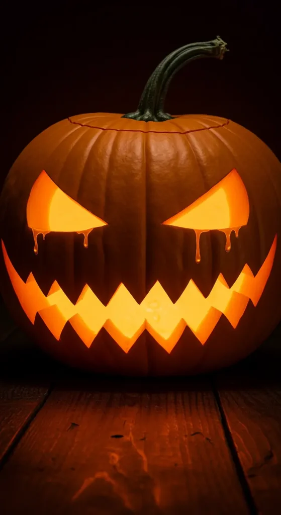
- Best For: Traditionalists who love the quintessential symbol of Halloween.
- Key Consideration: The expression is everything. Choose a menacing grin for a scary vibe or a goofy one for a more playful feel. A high-contrast image with a bright orange glow is key.
- Pro-Tip: Find a wallpaper where the jack-o’-lantern is off-center. This creates a more dynamic composition and leaves a clean area for your main widgets.
- Styling Cue: Use a clock widget with a spooky, dripping font and set the color to the same orange as the pumpkin’s glow.
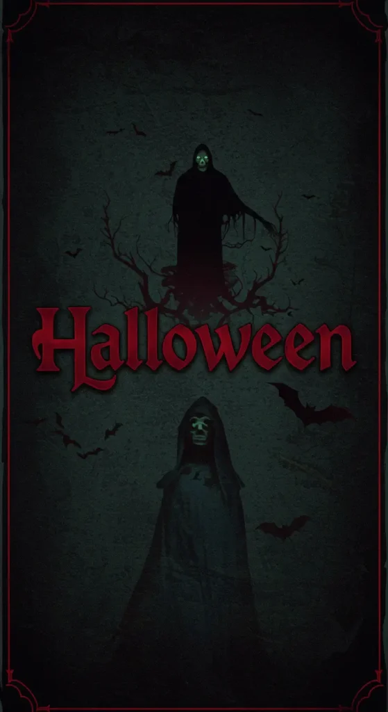
2. The Haunted House on the Hill
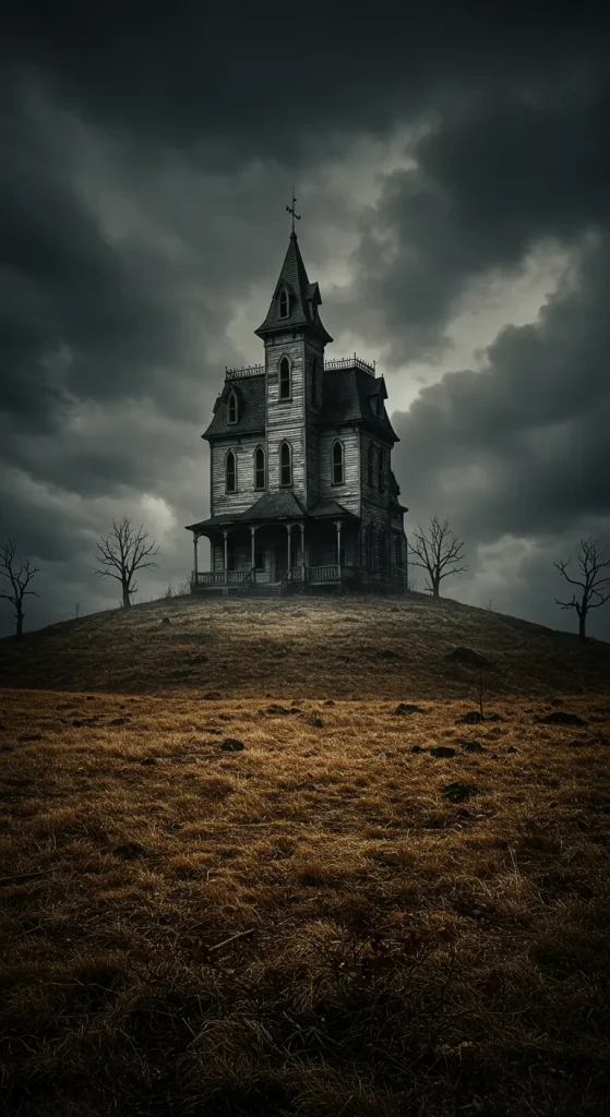
- Best For: Storytellers who want a wallpaper that feels like a scene from a horror movie.
- Key Consideration: Look for a strong silhouette. The details of the house should be minimal, with the focus on its jagged, dark shape against a hazy orange sky or moon.
- Pro-Tip: A wallpaper with a single lit window in the dark house adds a perfect touch of mystery and suspense.
- Styling Cue: Pair this with a weather widget that feels thematic, like one showing phases of the moon.
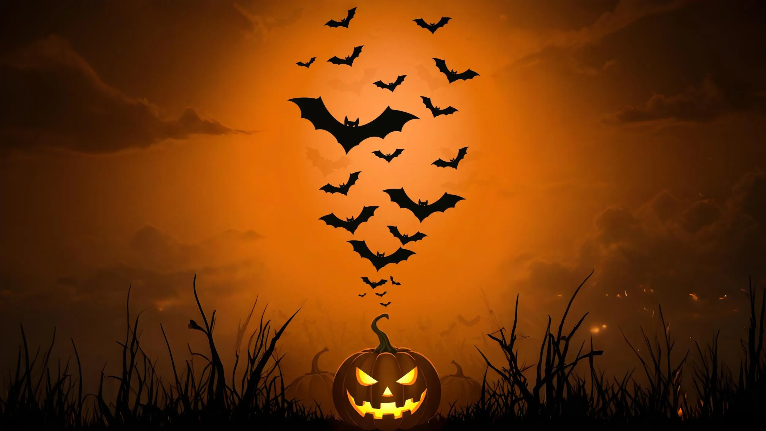
3. The Minimalist Bat Swarm

- Best For: Those who want a spooky but chic and uncluttered look.
- Key Consideration: This is all about negative space. The background should be a solid, deep black, with a graceful swarm of small orange or silhouetted bats flying across one corner.
- Pro-Tip: This design is perfect for a desktop, as you can arrange your icons on the opposite side of the swarm for a clean, organized workspace.
- Styling Cue: Match this with a super simple, minimalist icon pack in solid white or orange.
4. The Eerie Autumn Forest
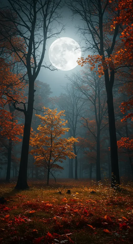
- Best For: Nature lovers with a dark side. It’s more atmospheric and unsettling than outright scary.
- Key Consideration: Look for images of dark, leafless tree silhouettes against a foggy orange backdrop. The focus should be on the twisted, gnarled branches.
- Pro-Tip: Find a “depth effect” wallpaper (for iOS) where the clock can be tucked behind one of the tree branches for a cool, layered look.
- Styling Cue: Use a calendar widget and highlight your October events in a muted orange color.
5. The Vintage Halloween Pattern
- Best For: Fans of retro charm and nostalgia. Think classic 1950s Halloween decorations.
- Key Consideration: These patterns often feature black cats with arched backs, simple jack-o’-lanterns, and cartoonish ghosts. The orange is often slightly faded, and the black is more of a dark grey.
- Pro-Tip: Because these patterns can be busy, use your phone’s “blur” feature for the home screen version. This softens the background and makes your icons pop.
- Styling Cue: Find a retro font for your clock widget to complete the vintage feel.
6. The Sinister Orange Moon
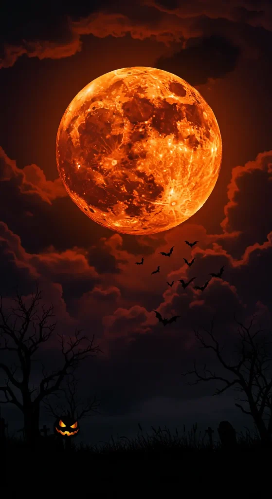
- Best For: A powerful, mystical, and minimalist statement.
- Key Consideration: The moon is the star. It should be a large, glowing harvest moon in a deep orange hue, set against a solid black sky.
- Pro-Tip: Look for a version with a subtle silhouette of a witch on a broomstick or a few bats flying across the moon for an extra narrative touch.
- Styling Cue: This is perfect for a lock screen, where the time and date can sit cleanly above or below the moon.
7. The Gothic Damask Pattern
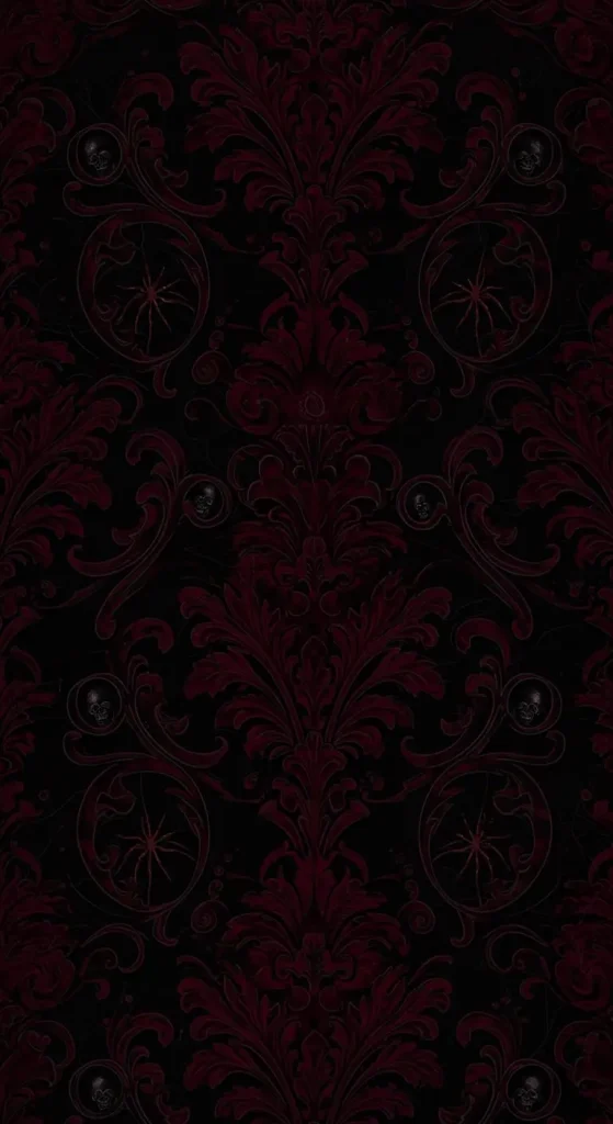
- Best For: A sophisticated, elegant, and subtly spooky “haunted mansion” vibe.
- Key Consideration: This is a repeating, ornate pattern, but in a spooky color scheme. Look for intricate black-on-black designs with hints of dark orange in the details.
- Pro-Tip: This textured, low-contrast look is excellent as a home screen background because it adds atmosphere without visually competing with your app icons.
- Styling Cue: Pair with elegant, serif font widgets for a truly gothic aesthetic.
8. The Abstract Smoke & Embers

- Best For: Modernists and minimalists who want texture and mood over a specific image.
- Key Consideration: Imagine the look of dying embers in a fire pit or wisps of orange smoke against a black background. It’s all about atmosphere and color.
- Pro-Tip: This style is very forgiving for icon placement, as there’s no single focal point for your apps to cover up.
- Styling Cue: A perfect match for a minimalist setup with no app labels and transparent widgets.
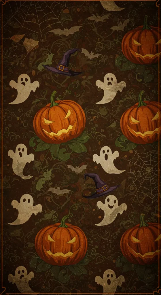
9. The Playful Ghost Parade
- Best For: Anyone who prefers “spooky-cute” over genuinely scary.
- Key Consideration: Look for a simple pattern of little cartoon ghosts on a black background, with some of them carrying tiny orange pumpkins or wearing little hats.
- Pro-Tip: This is a great opportunity to create your own! A simple ghost shape is easy to draw in an app like Procreate, then arrange into a repeating pattern.
- Styling Cue: Use fun, bubbly app icons and widgets with rounded corners to match the cute aesthetic.
10. The Single, Ominous Word
- Best For: Typophiles and minimalists who want their wallpaper to make a statement.
- Key Consideration: The font is crucial. Choose a spooky, dripping, or scratchy font for a single word like “BOO,” “SPOOKY,” or “October” in vibrant orange on a black background.
- Pro-Tip: Place the word at the very bottom or top of the screen, leaving the majority of the space open and clean for your icons.
- Styling Cue: Remove all app labels from your home screen to let the single word have maximum impact.
11. The Spider’s Web Corner

- Best For: A subtle, creepy-crawly design that’s more elegant than scary.
- Key Consideration: Look for a design where a delicate, thin orange spider’s web is spun in just one corner of a black screen.
- Pro-Tip: Add a tiny, silhouetted spider dangling from a thread for an extra touch of fright.
- Styling Cue: This is another fantastic desktop wallpaper, allowing you to neatly tuck your files and folders away from the web design.
12. The Glowing Eyes in the Dark
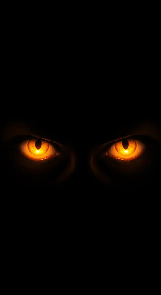
- Best For: A genuinely unsettling and minimalist horror aesthetic.
- Key Consideration: This is pure minimalism. The screen is almost entirely black, with just one or two pairs of glowing, menacing orange eyes staring out from the darkness.
- Pro-Tip: This is extremely effective on OLED screens, where the black is absolute, making the orange eyes seem to float in a void.
- Styling Cue: Keep it simple. Use a stark white font for the clock on your lock screen for maximum contrast.
13. The Witch’s Cauldron
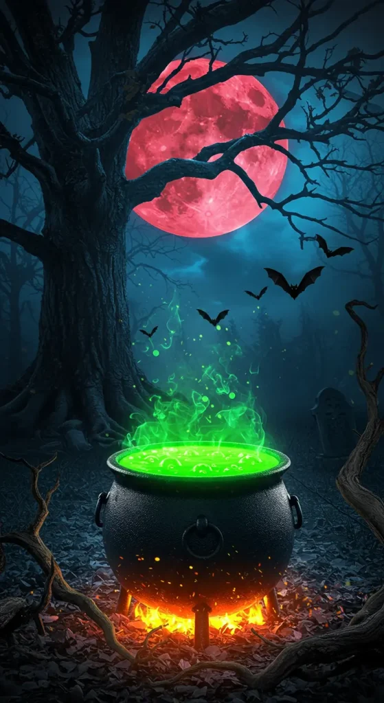
- Best For: Fans of witchy vibes and magical aesthetics.
- Key Consideration: Find an image of a black cauldron with bubbling orange potion spilling over the sides, or with orange steam and stars rising from it.
- Pro-Tip: Look for a “flat design” or vector illustration style for a more modern, graphic take on this classic trope.
- Styling Cue: Pair with widgets that show the moon phase or a “quote of the day” featuring a line from a spell or a Shakespeare play.
14. The Field of Pumpkins

- Best For: An immersive, atmospheric look that feels like you’re standing in a haunted pumpkin patch.
- Key Consideration: This is a “from the ground” perspective, looking across a field of dozens of glowing jack-o’-lanterns that fade into a dark, black horizon.
- Pro-Tip: The “horizon line” in the wallpaper is a natural place to put a row of app dock icons, making the screen feel organized and integrated.
- Styling Cue: Use a photo widget to display your own fall pictures, creating a collage effect with the wallpaper.
15. The Candy Corn Pattern

- Best For: A sweet, graphic, and controversial take on the Halloween aesthetic.
- Key Consideration: A simple, repeating pattern of candy corn (orange, yellow, and white) on a black background. The graphic, geometric shapes make it feel modern.
- Pro-Tip: For a more subtle look, find a version where the pattern is very small and dense, creating an overall texture rather than large, distinct shapes.
- Styling Cue: Go all out! Find candy corn-colored app icons and embrace the vibrant, playful look.
Conclusion: Your Screen’s Next Act
And just like that, you’re no longer just looking at your phone you’re looking at a world of spooky possibilities. You have the ideas, the inspiration, and the know-how to curate a Halloween aesthetic that’s stylish, atmospheric, and a true reflection of you.
This isn’t just about changing a picture; it’s about setting the mood for the entire season, one glance at your screen at a time.
It all starts with a single choice. Pick a style that gave you a delightful shiver, and let the haunting begin. You’ve got this.
