
Is your phone screen still holding onto the bright glare of summer? A generic photo on a bright screen that feels out of sync with the crisp, cool air? You’re in the right place to change that.
A wallpaper shouldn’t just be a picture; it should be the mood board for your season, a backdrop for cozy evenings with a book, quiet mornings with a warm drink, and the simple beauty of the changing world.
This is your creative playbook for transforming that screen into a feature that’s not only stylish and atmospheric but feels deeply, personally autumnal.
We’ll explore elegant textures, decode the secrets of a moody aesthetic, and find the perfect image to bring it all to life.
By the end, you’ll see your screen not as a utility, but as a pocket-sized window to your own cozy, autumn story.
Before You Begin: Dreaming Up Your Perfect Autumn Mood
The most beautiful aesthetics start with a little bit of soul-searching, not just a frantic image search.
Before you download a single pixel, let’s lay the groundwork for a look you’ll love all season long. Are you craving a vibe that is rustic and cozy, dark and mystical, or clean and minimalist?
The Secrets of Style: Simple Rules for a Stunning Look
Design theory sounds intimidating, but it’s really just about what makes an image feel right. Here are a few simple secrets for the perfect dark fall wallpaper:
Getting the Scale Right: The subject of your wallpaper should feel at home on your screen, leaving room for your app icons and widgets.
- For a busy home screen: Choose a repeating texture (like wood grain or a knit pattern) or a design with lots of negative space where your icons can live peacefully.
- For a clean lock screen: Go for a bold, single subject, like one perfect leaf or a flickering candle flame.
Creating Balance: A rich, dark image has its own visual weight. You can balance it in two ways:
- Symmetrical Balance: Think of a single acorn perfectly centered against a dark, textured background. This feels calm, grounded, and elegant.
- Asymmetrical Balance: Imagine the silhouette of gnarled branches creeping in from the right side of the screen. This feels more modern, dynamic, and organic.
The Dark Autumn Color Story: This is the key to achieving a sophisticated fall palette:
- 60% is your dominant color: A deep, moody neutral like charcoal, dark chocolate brown, or deep navy. This creates the cozy atmosphere and makes your icons legible.
- 30% is your secondary color: A rich, desaturated earth tone like burgundy, forest green, or deep plum. This adds depth without being overly bright.
- 10% is your accent: A tiny, glowing pop of amber, copper, or muted gold. This is the single leaf, the candle flame, the last ray of sun.
Embrace the Negative Space: The darkness is not empty space; it is the design. A simple, small subject on a vast, dark background often has more impact than a cluttered, busy scene. Let your subject breathe.
The Wallpaper Toolkit: From Download to Display
| The Approach | Where to Look | What You Get | The Little Extras (Don’t Skip These!) |
| The Quick Find | Pinterest, Unsplash, Pexels | • Thousands of free, high-quality photos • Instant seasonal gratification | • The screenshot tool for quick cropping • Your phone’s built-in “blur” feature |
| The Curated Search | Behance, ArtStation, Instagram (#darkacademia) | • Unique art from independent creators • A more artistic, less “stock” feel | • Following your favorite artists • Searching for specific moody aesthetics |
| The Custom Creation | Canva, Procreate, AI Art Generators (Midjourney) | • A 100% unique wallpaper made by you • Perfect resolution and composition | • Widget customizer apps (Widgetsmith) • Custom icon packs (from Etsy) |
The Wallpaper Gallery: Finding Your Signature Mood
Here are the ingredients for your perfect dark fall wallpaper. Each one focuses on simplicity, texture, and a deep, atmospheric feeling.
1. The Single Faded Leaf
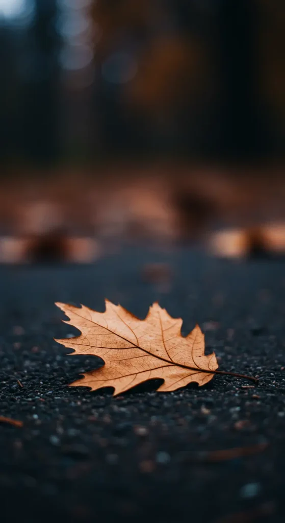
- Best For: A minimalist, elegant, and classic autumn statement.
- Key Consideration: Look for a macro shot of a single, dried leaf against a dark, simple background like slate or dark wood. The beauty is in the delicate veins and imperfections.
- Pro-Tip: Find an image where the leaf is off-center. This creates a more dynamic composition and leaves a clean area for your main widgets.
- Styling Cue: Use a clock widget with a clean, serif font and set the color to a muted cream or beige pulled from the leaf’s highlights.
2. The Bare Branches Silhouette
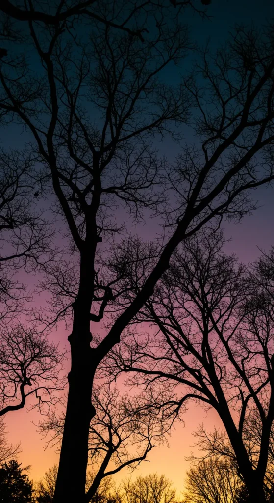
- Best For: A moody, slightly gothic look that is both beautiful and stark.
- Key Consideration: The focus should be on the intricate, web-like shapes of leafless branches against a dark, fading sky (think deep grey, navy, or plum).
- Pro-Tip: This design is perfect for an iOS “depth effect” lock screen, where the clock can be tucked behind one of the larger branches for a cool, layered look.
- Styling Cue: Match this with a simple, minimalist icon pack in solid white or grey.
3. Rain on a Windowpane
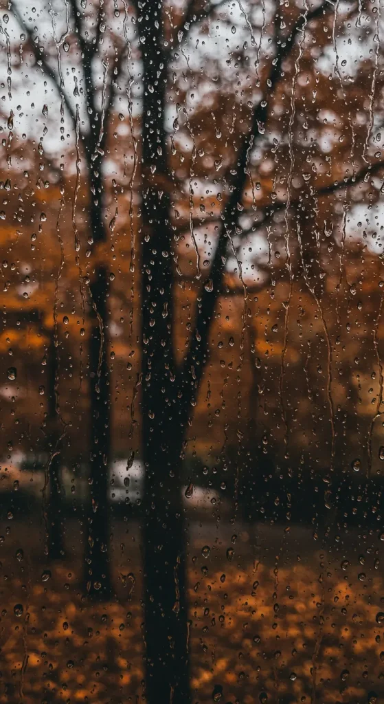
- Best For: The ultimate cozy, “staying in” vibe. It’s atmospheric, abstract, and calming.
- Key Consideration: Look for a photo taken at dusk or at night, where the water droplets are catching the faint light against a dark, blurry background.
- Pro-Tip: Because this pattern is abstract and has no focal point, it’s a perfect home screen background. It won’t compete with your app icons at all.
- Styling Cue: Pair this with a weather widget. It’s a perfect meta-commentary on the cozy, rainy day mood.
4. The Moody Pumpkin Still Life

- Best For: A sophisticated, rustic take on the season’s most iconic gourd.
- Key Consideration: This is not a bright orange jack-o’-lantern. Look for dark, heirloom pumpkins (greens, greys, deep oranges) arranged against a dark wood or slate background, with dramatic, shadowy lighting (chiaroscuro).
- Pro-Tip: This makes a fantastic tablet or desktop background, where the wider screen can accommodate a beautiful, artful composition.
- Styling Cue: Use warm-toned, minimalist icons to complement the rustic, painterly feel.
5. The Chunky Knit Texture
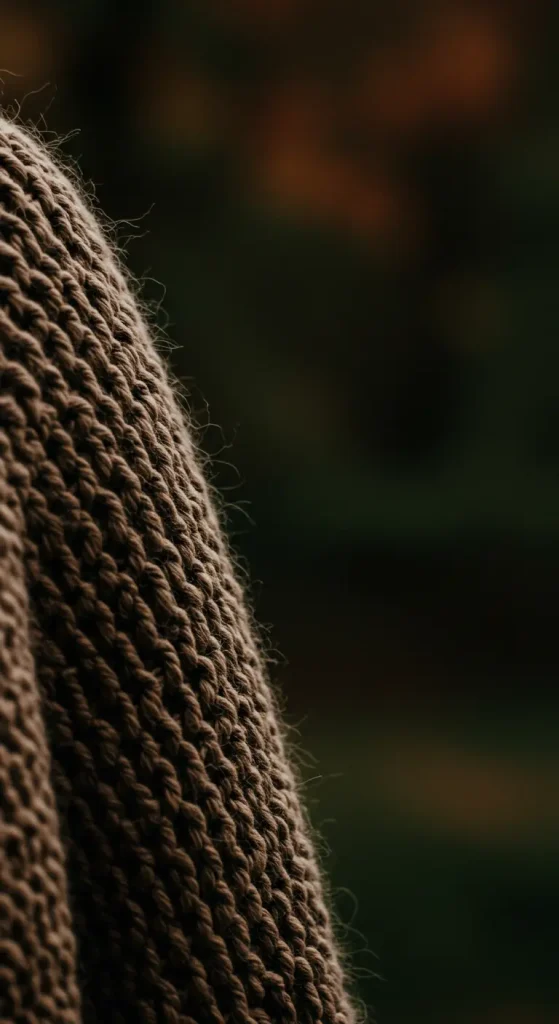
- Best For: Pure, unadulterated coziness. It’s like wrapping your phone in your favorite sweater.
- Key Consideration: A macro, close-up shot is key. You want to see the texture and fibers of the knit in a deep, autumnal color like charcoal, burgundy, or forest green.
- Pro-Tip: This is another perfect home screen wallpaper. It’s visually interesting but completely uniform, allowing your icons and widgets to be the stars.
- Styling Cue: Customize your widgets to have a semi-transparent background, which will allow the cozy texture to show through.
6. The Flickering Candle Flame

- Best For: A simple, warm, and almost meditative background.
- Key Consideration: The image should be overwhelmingly dark, with the single, soft glow of the candle flame as the only subject.
- Pro-Tip: This makes for a stunning lock screen. The simple, bright flame is a beautiful focal point every time you wake your phone.
- Styling Cue: Use a simple, elegant clock font. The combination of the flame and the time feels timeless and classic.
7. The Misty Forest Morning
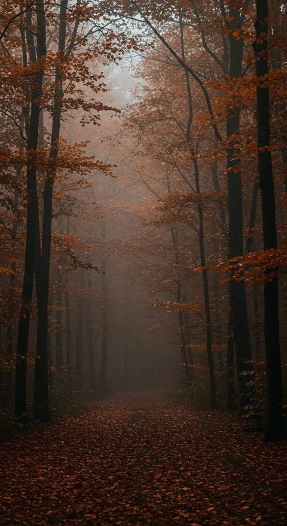
- Best For: An atmospheric, mysterious, and slightly eerie vibe.
- Key Consideration: Look for photos taken in the very early morning, where thick fog obscures the details of the forest, leaving only the dark trunks of trees and a muted, greyish light.
- Pro-Tip: The vertical lines of the tree trunks naturally draw the eye up and down the screen, making this a very flattering composition for a phone.
- Styling Cue: Pair with a “quote of the day” widget featuring lines from poets like Robert Frost.
8. The Dark Wood Grain

- Best For: A rustic, simple, and beautifully textured neutral background.
- Key Consideration: Find a high-resolution image of a dark wood, like walnut or a stained oak. The focus should be on the natural lines and knots of the grain.
- Pro-Tip: This is the ultimate versatile home screen. It adds warmth and texture without ever looking busy, and it works with any icon style.
- Styling Cue: This pairs perfectly with a “photo” widget, as the wood grain acts like a beautiful frame or tabletop for your pictures.
9. The Crow’s Silhouette
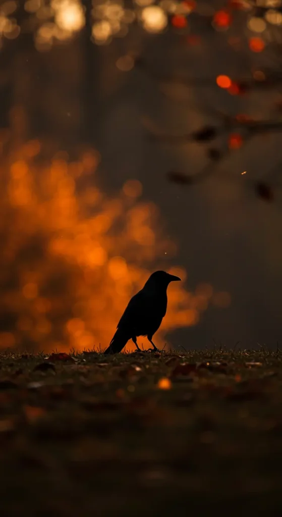
- Best For: A gothic, intelligent, and mysterious aesthetic.
- Key Consideration: A single, black crow perched on a gnarled branch against a very dark, stormy, or twilight sky. The power is in the stark silhouette.
- –Pro-Tip: Position the crow on one side of the screen, looking into the negative space. This creates a sense of contemplation and narrative.
- Styling Cue: This looks fantastic with a calendar widget, with the days laid out in a clean grid below the crow’s perch.
10. The Glistening Dew on a Spiderweb
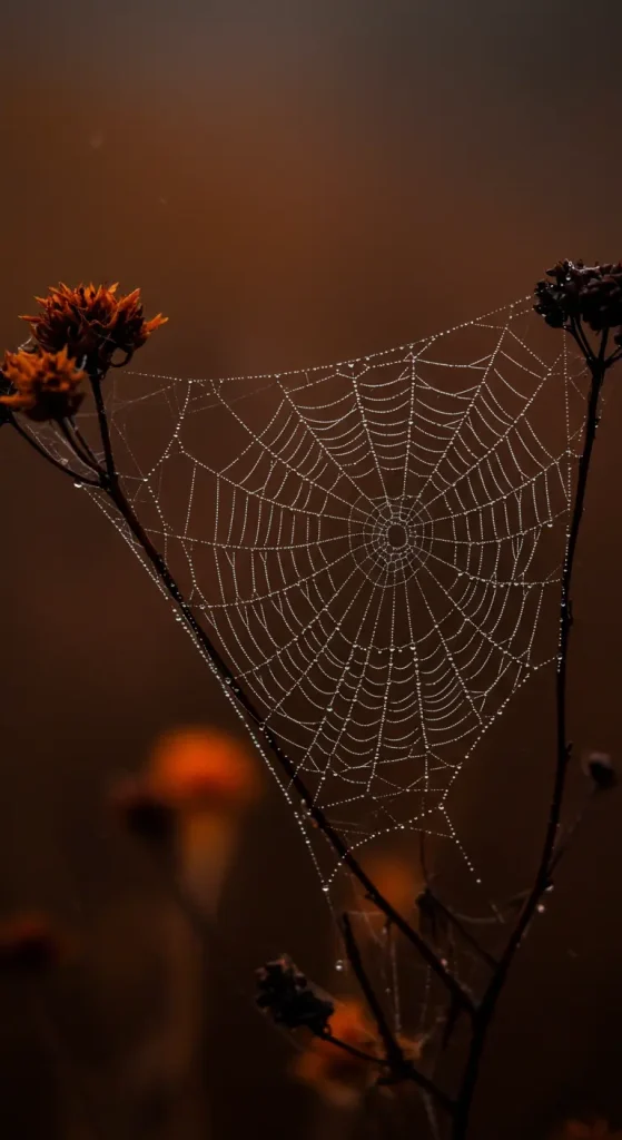
- Best For: An intricate, beautiful, and subtly spooky look that celebrates the beauty of a crisp autumn morning.
- Key Consideration: This must be a macro shot. The focus is the delicate web with tiny, glistening water droplets, almost like a string of diamonds, against a dark, out-of-focus background.
- Pro-Tip: This can be a busy image, so use your phone’s “blur” feature for the home screen version. This preserves the color and mood while making your icons easy to read.
- Styling Cue: Use minimalist, glyph-style icons that won’t compete with the intricate detail of the web.
11. The Abstract Autumn Gradient

- Best For: A modern, minimalist who wants mood and color without any specific objects.
- Key Consideration: This is a smooth, digital blend of dark fall colors think a gradient that moves from deep plum to burnt orange to charcoal grey.
- Pro-Tip: Create your own! Many free apps allow you to create custom color gradients, so you can make one that perfectly matches your phone case or your favorite sweater.
- Styling Cue: This is the perfect canvas for a highly customized home screen with unique widgets and icon packs, as the background will never clash.
12. The Smoky Bonfire Embers

- Best For: A warm, mesmerizing, and textured background that captures the feeling of a late-night bonfire.
- Key Consideration: The focus is not on the big, bright flames, but on the deep, glowing red and orange coals and embers with wisps of smoke.
- Pro-Tip: This looks incredible on OLED screens, where the deep blacks make the glowing embers seem to pop with incredible vibrancy.
- Styling Cue: Use a music player widget. The combination of the warm embers and your favorite fall playlist is pure atmosphere.
13. The Weathered Stone and Moss
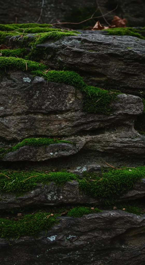
- Best For: An ancient, earthy, and richly textured vibe. Think old walls, ruins, or a forgotten corner of a forest.
- Key Consideration: A close-up shot is key. You want to see the texture of the dark, damp stone and the vibrant green of the moss growing in its cracks.
- Pro-Tip: This is a great “neutral” background that is far more interesting than a simple solid color. It adds an organic, historic feel to your modern tech.
- Styling Cue: Perfect for a “dark academia” aesthetic, paired with widgets showing quotes in a classic typewriter font.
14. The Single Acorn or Pinecone
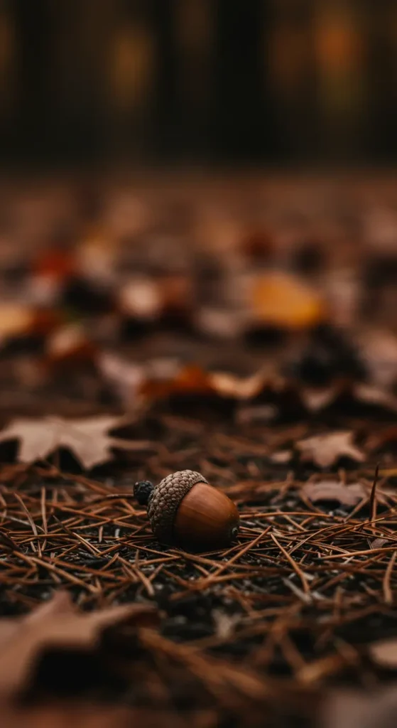
- Best For: A clean, minimalist, and beautifully detailed study of a small, natural object.
- Key Consideration: The object should be placed on a very dark, plain background. The lighting should be soft, highlighting the texture and form of the acorn or pinecone.
- Pro-Tip: This is an ideal lock screen image. It’s simple, elegant, and perfectly centered, leaving ample clean space for your notifications.
- Styling Cue: Remove the labels from your app icons on your home screen for an ultra-clean, minimalist look that complements this wallpaper.
15. The Fading Gloaming
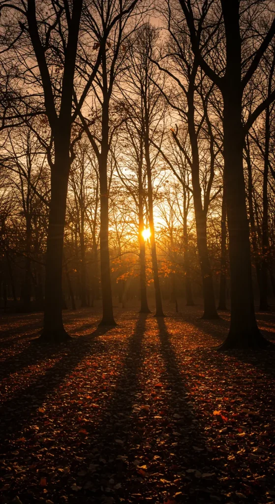
- Best For: A minimalist landscape that captures the magical, fleeting moment between sunset and night.
- Key Consideration: This is not a bright sunset. The image should be 90% dark, with just a last, thin sliver of deep orange or fiery red light along the horizon, fading into a deep indigo or black sky.
- Pro-Tip: The strong horizontal line of the horizon is a natural place to align a row of widgets or your app dock.
- Styling Cue: Use a simple, white digital clock. The stark white against the deep, fading colors is a beautiful and highly legible combination.
Conclusion: Your Screen’s Autumn Chapter
And just like that, you’re no longer just looking at your phone you’re looking at your own personal autumn mood board. You have the ideas, the inspiration, and the know-how to curate a seasonal aesthetic that is sophisticated, simple, and a true reflection of you.
This isn’t just about changing a picture; it’s about setting the tone for your season, one glance at your screen at a time.
It all starts with a single choice. Pick a style that made you want to grab a warm blanket, and embrace the cozy darkness. You’ve got this.
